Artichokes in the Studio Apartment
This studio apartment measures just 32 square meters. One of the significant advantages of the developer's layout is the storage room located at the entrance, which has been converted into a walk-in closet. The apartment features high ceilings, with a distance of 3 meters to the beam. The challenge was to fit everything necessary for one (or a maximum of two) person to live comfortably, as well as accommodate their guests.
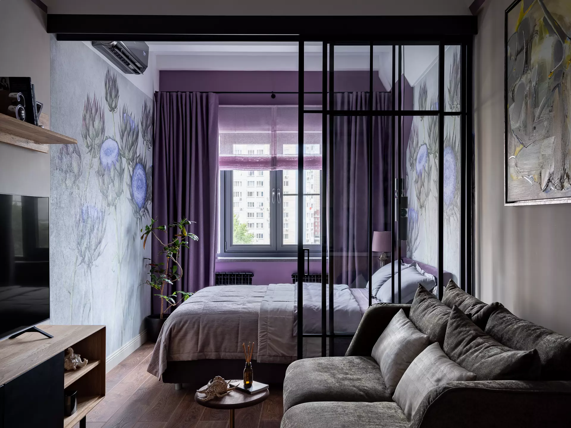
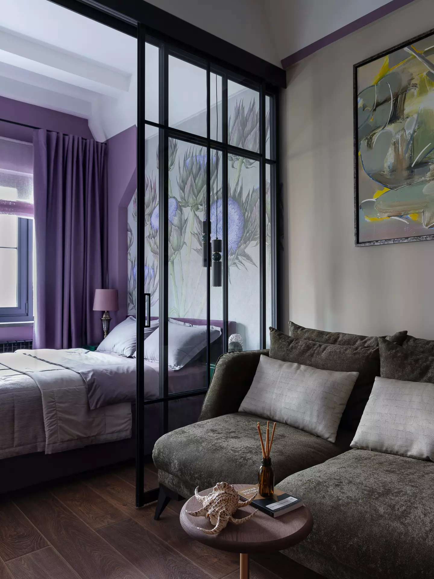
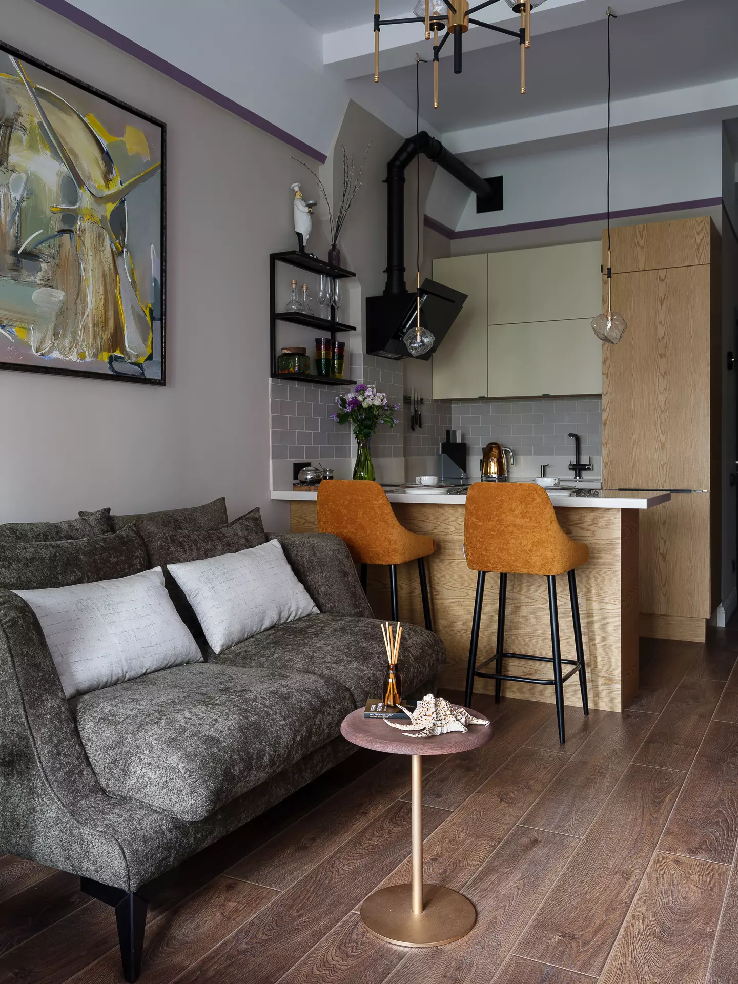
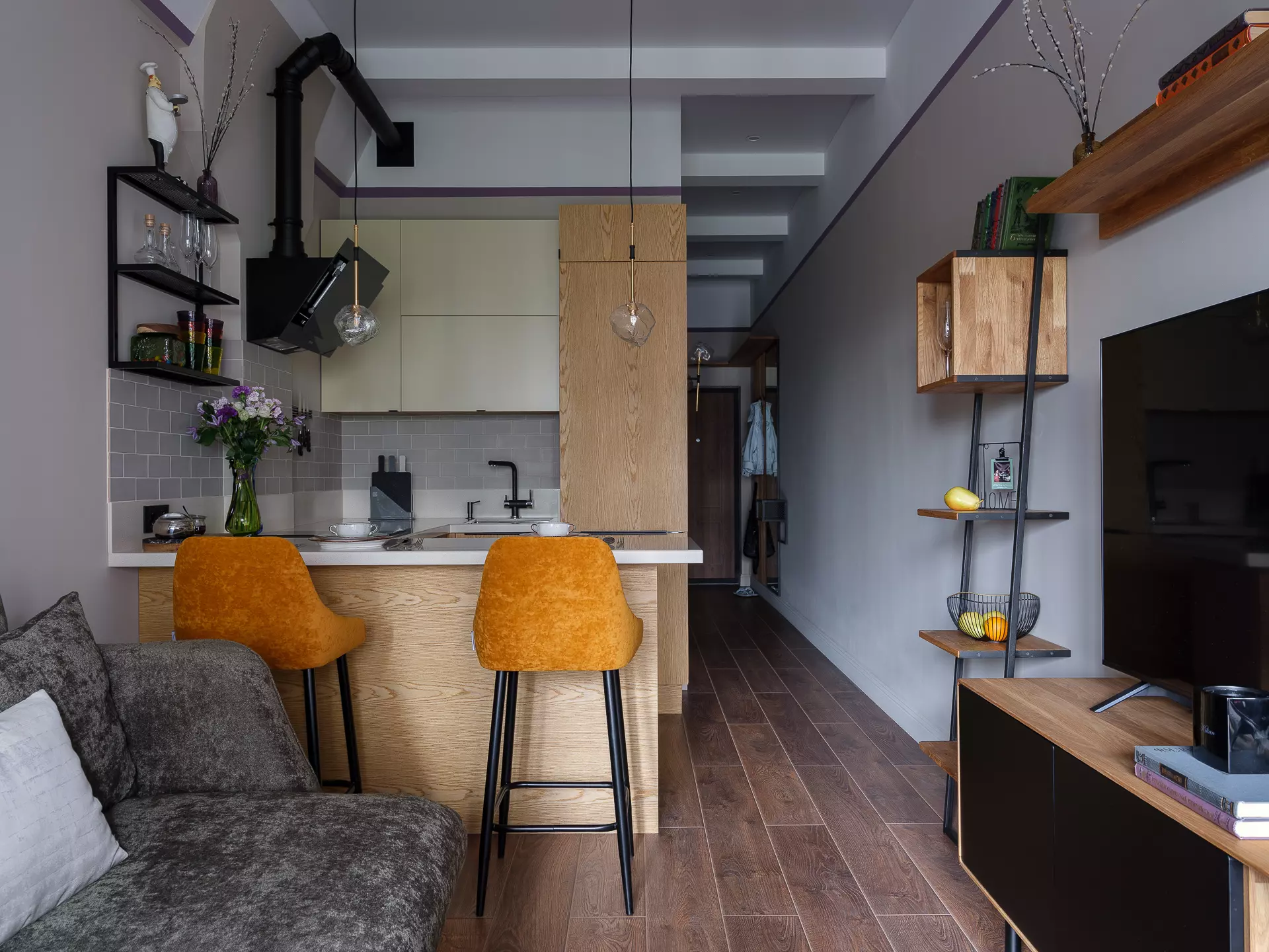
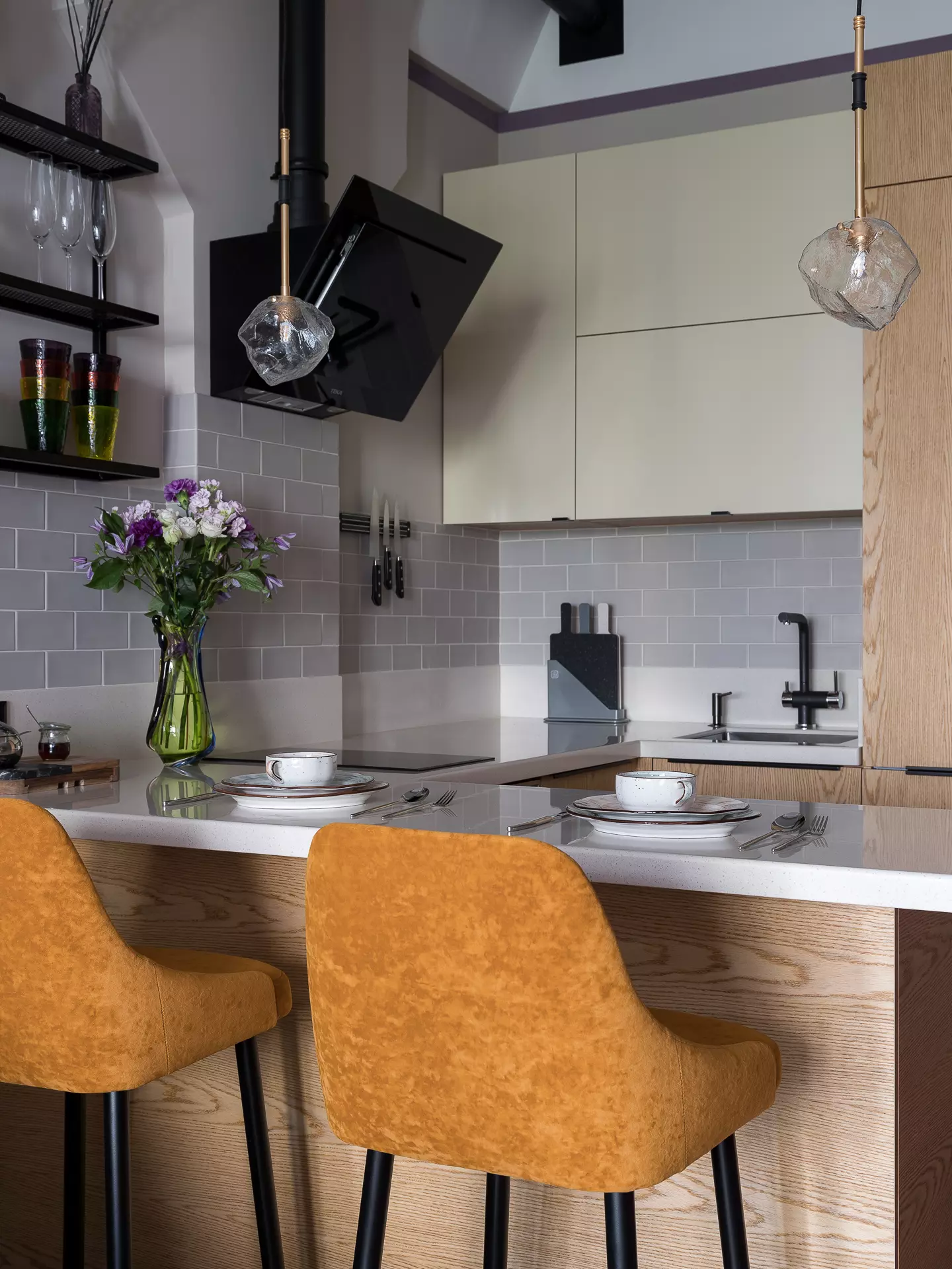
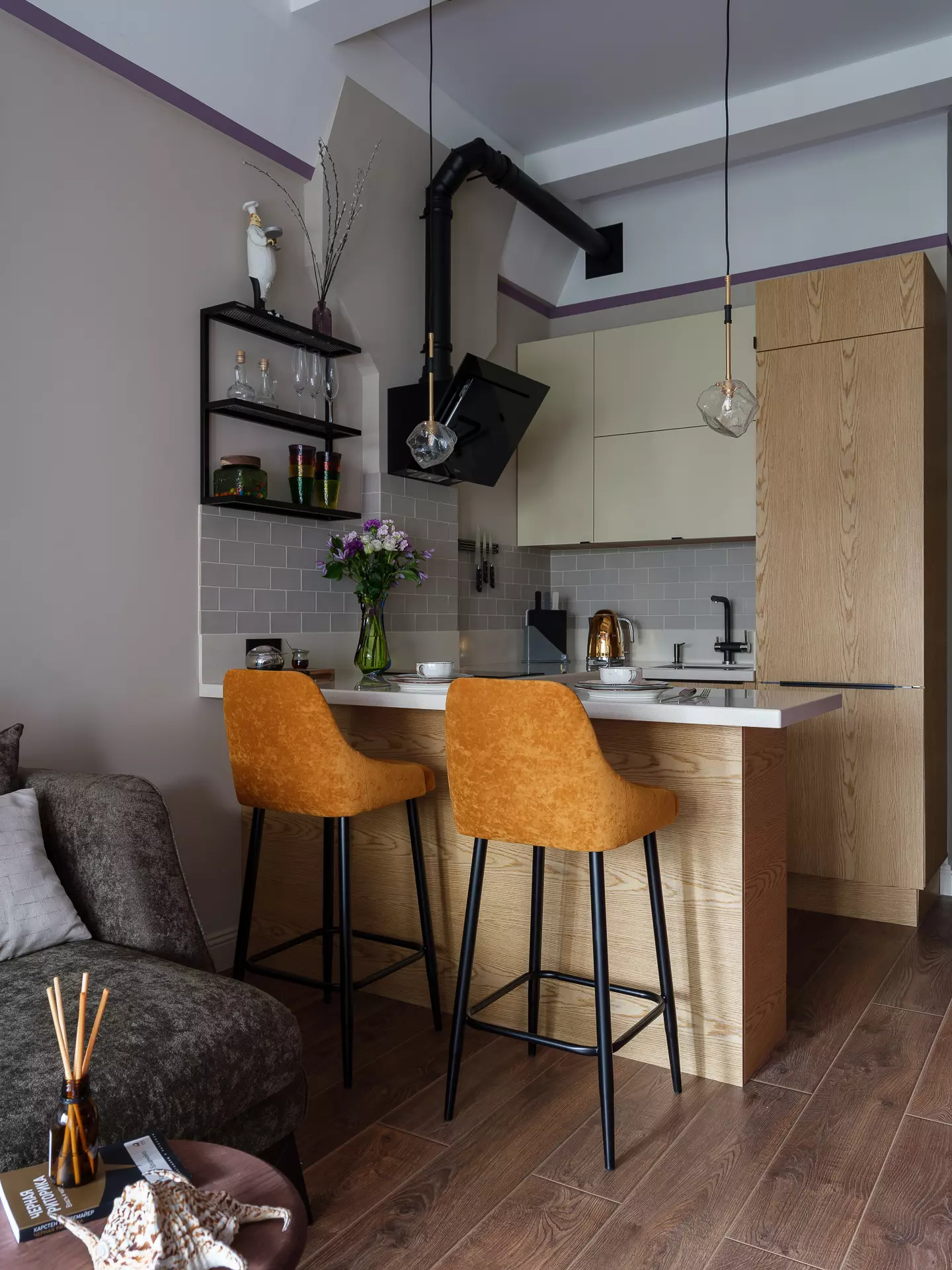
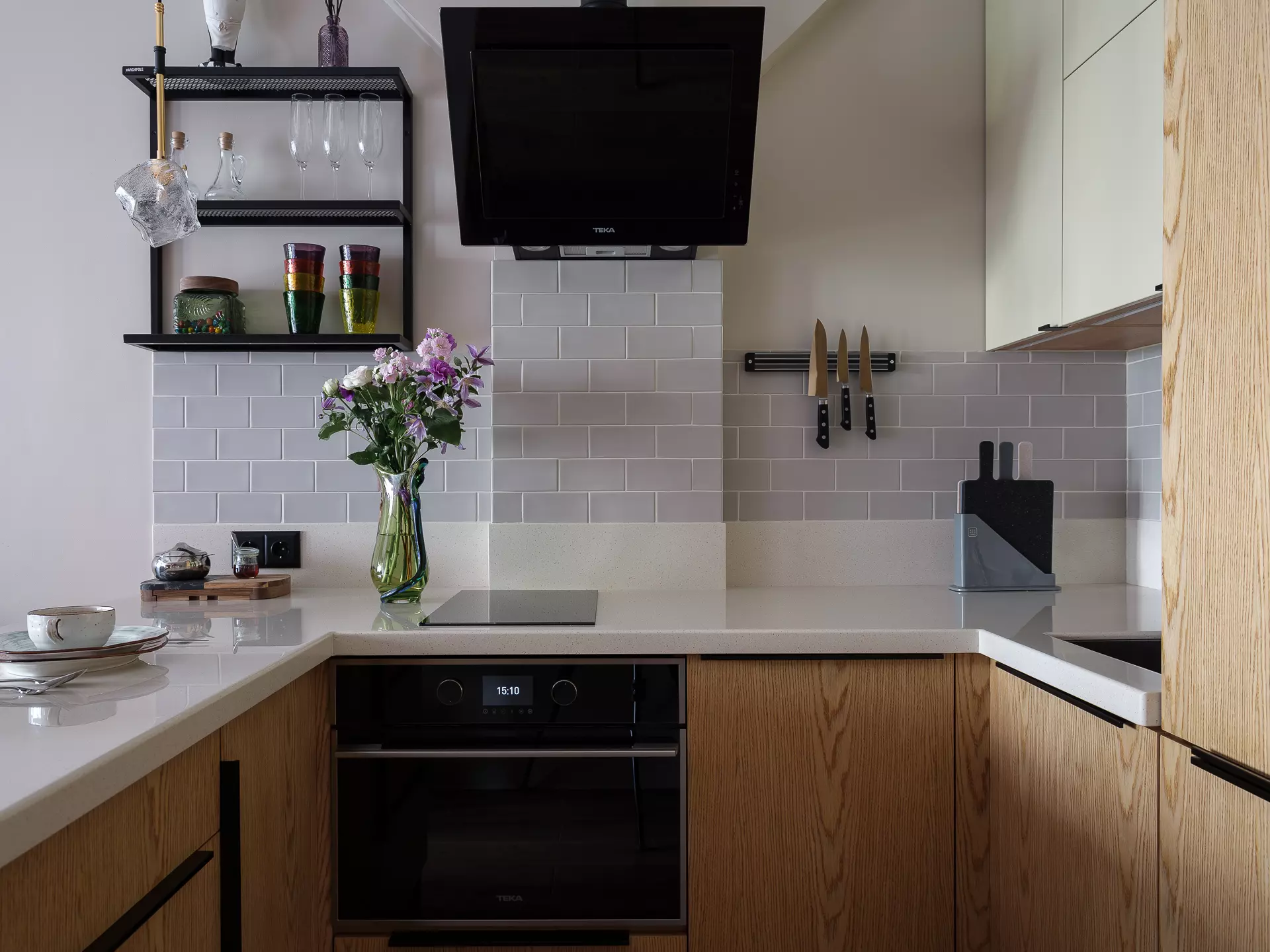
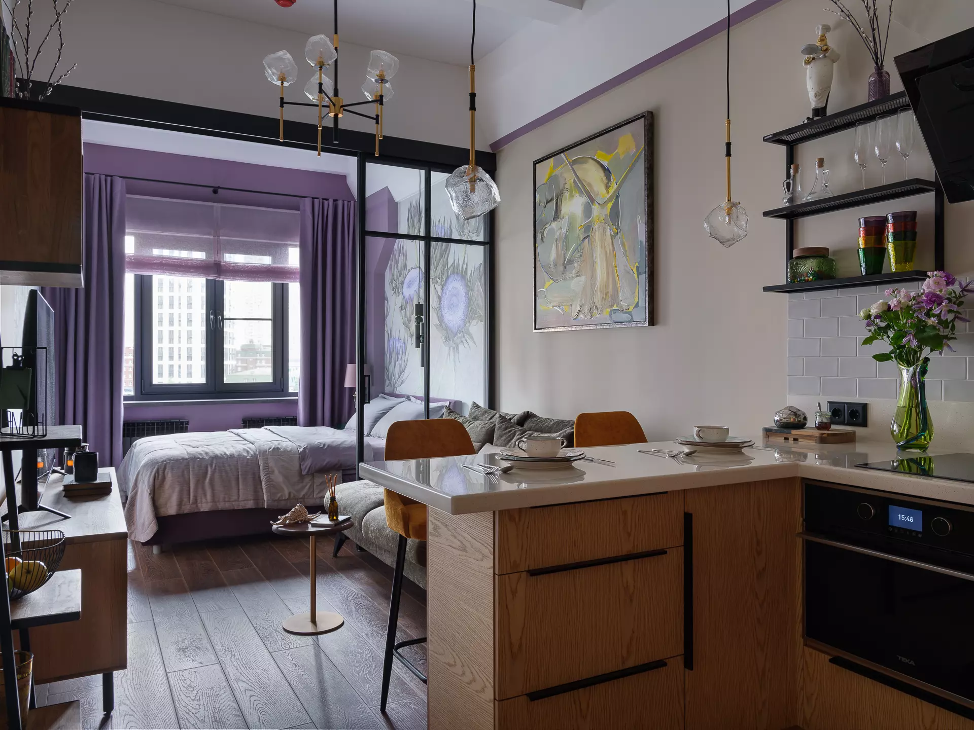
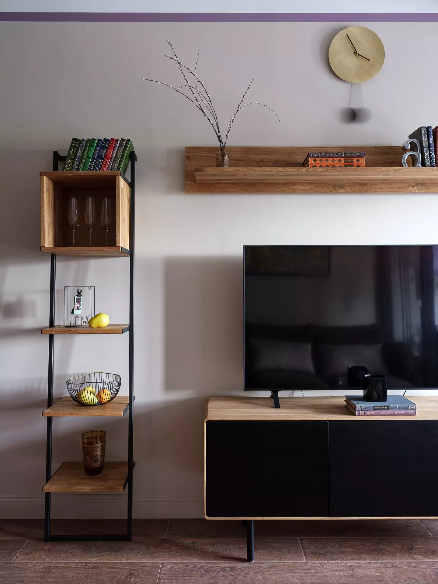
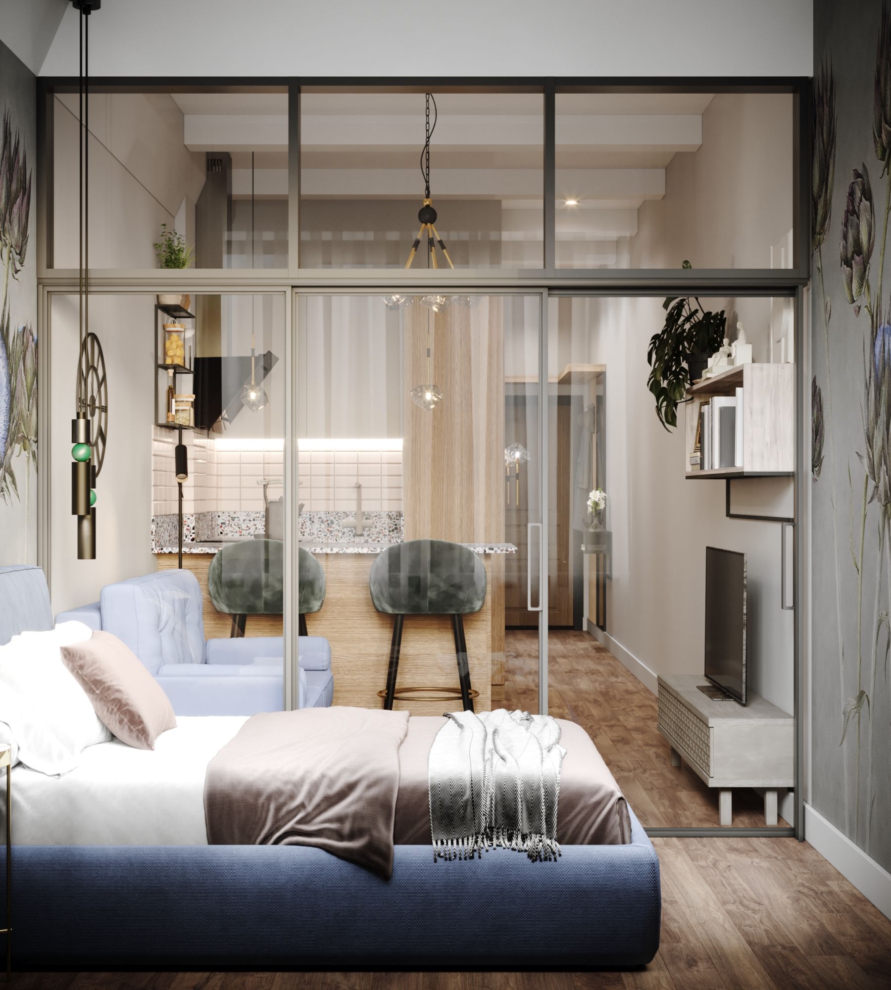
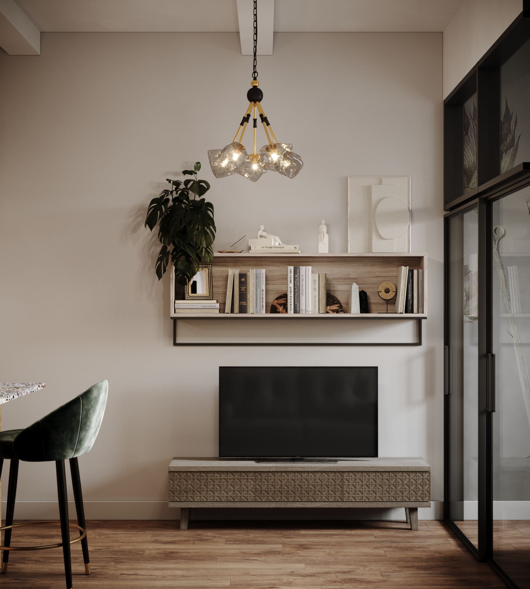
The kitchen is designed in a P-shape configuration, with the dining table doubling as an additional workspace. The living area is furnished with a small sofa (1400 mm) that can be converted into a bed and a TV stand. To separate the sleeping area from the shared spaces of the apartment, a glass partition has been installed. This allows for convenient use when one person wants to rest while the other is getting ready for work.
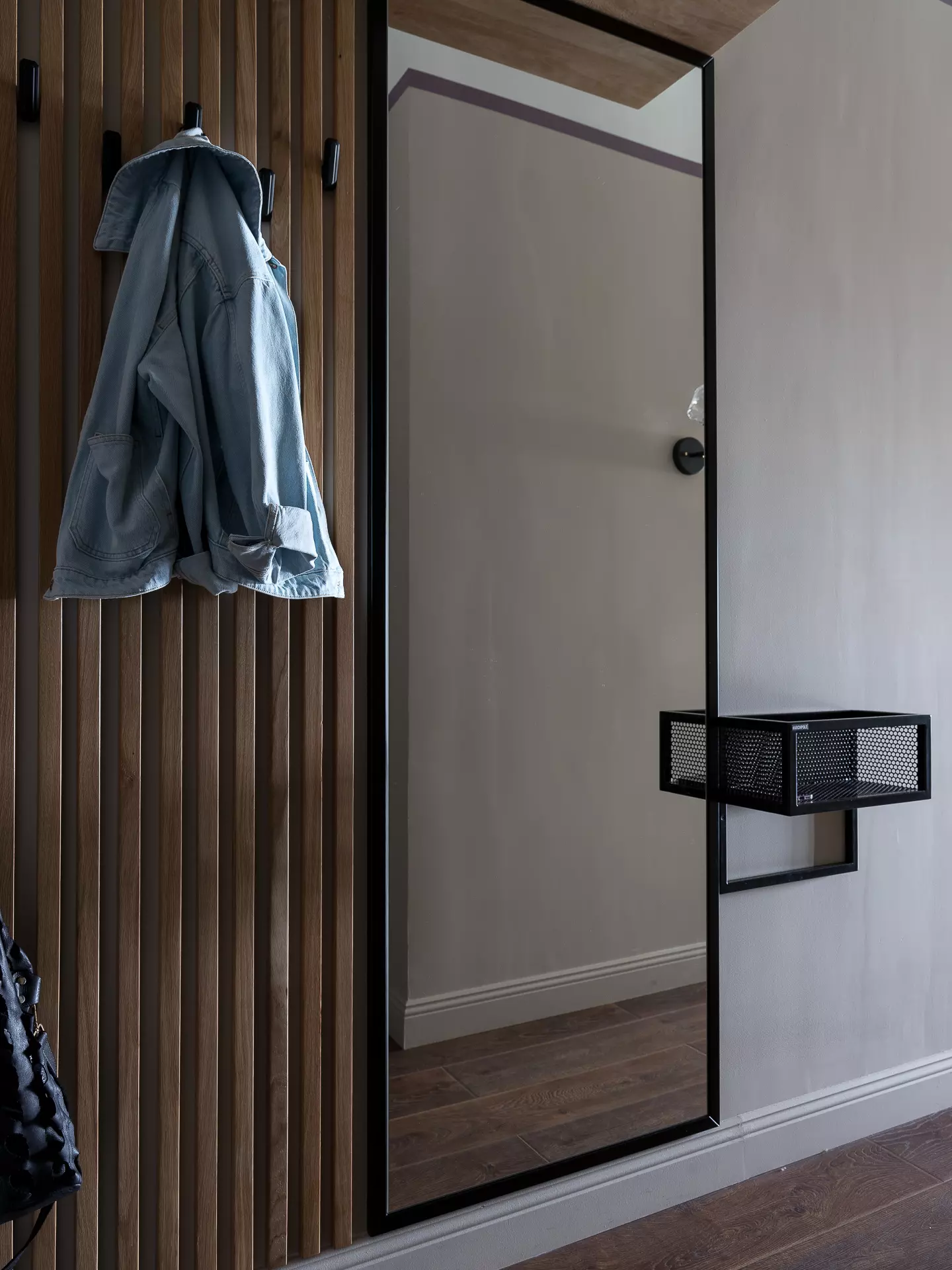
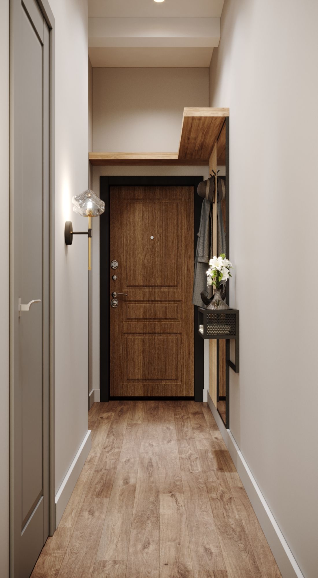
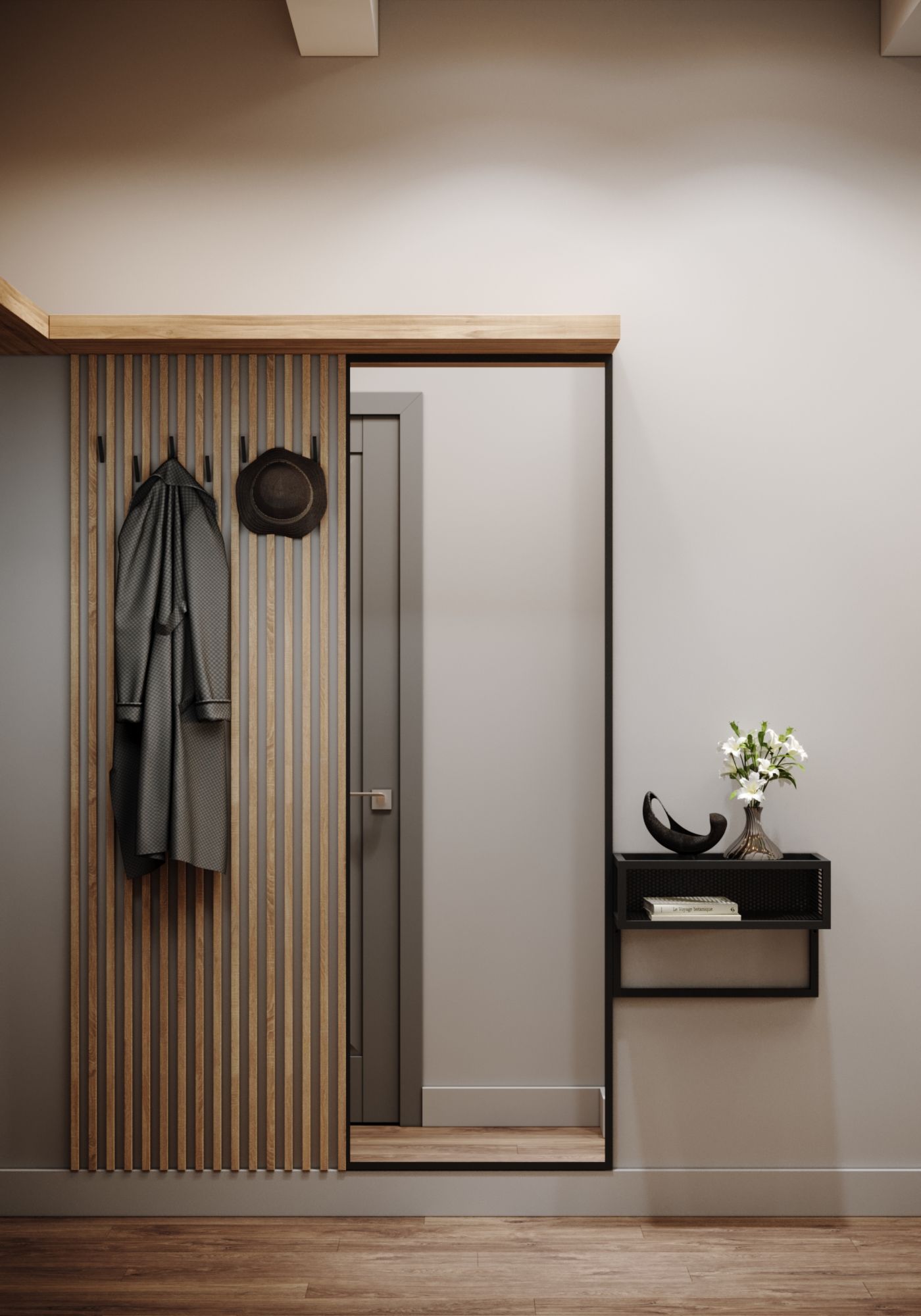
In the entrance area, a Euro-style dressing room has been added, providing convenience right upon entering the apartment. It allows for a quick change of clothes before proceeding further into the living space.
The apartments are situated in a building that was once the "Red Star" printing warehouse, where during Soviet times, Nikolai Ostrovsky's "How the Steel Was Tempered" was printed. This is a redevelopment project for unused print-house buildings on Begovaya in Moscow. The ceiling height ranges from 3.3m to 3m, with a consistent floor space of 31.5 m2.
For Whom?
The owner is an active woman in her early 50s. She often has friends over, and her young granddaughter might stay overnight. The goal was to fit a cooking, relaxation, and sleeping area, emulating the comfort level of a luxury hotel suite. After all, hotels are designed around guest convenience.
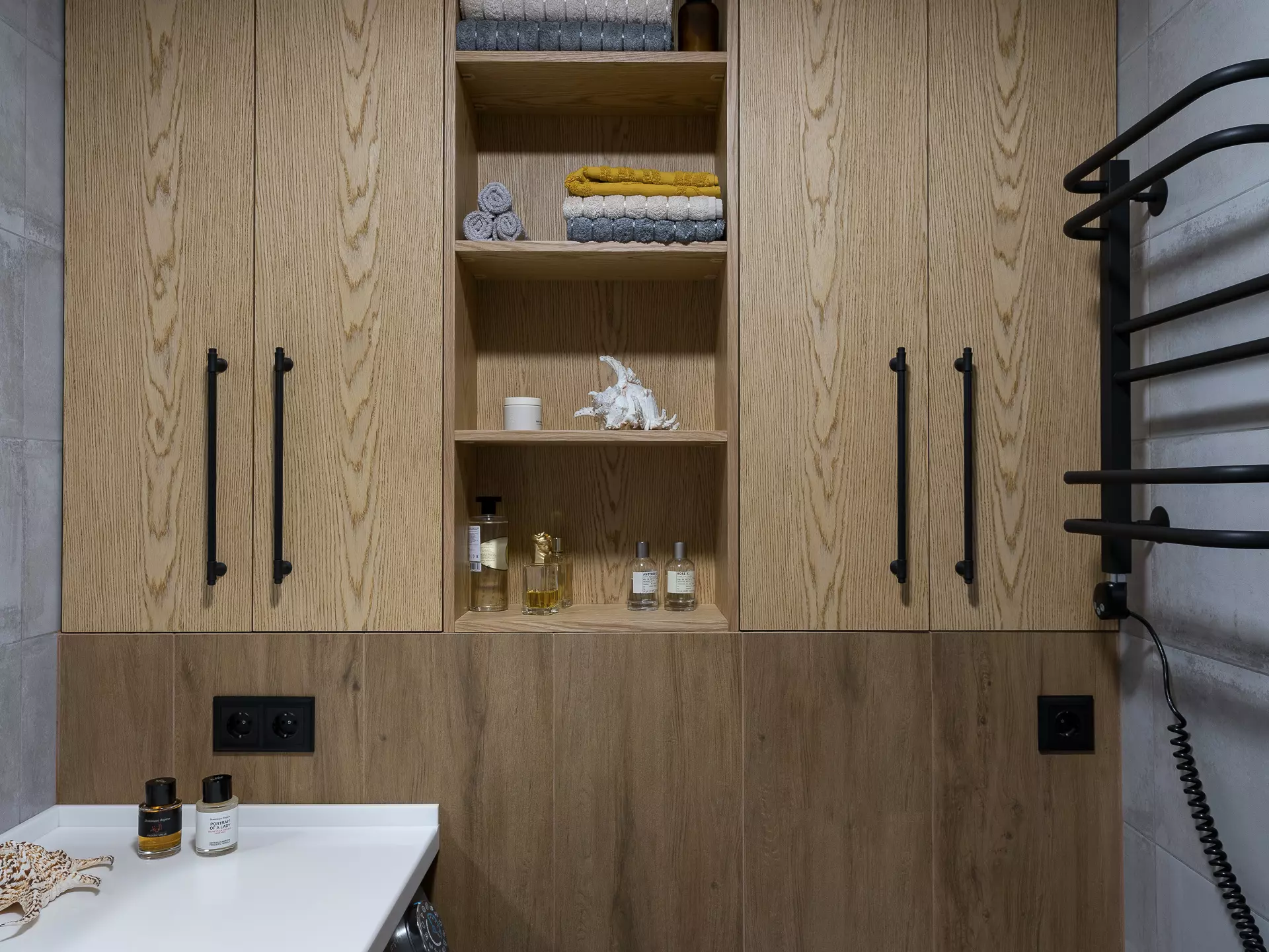
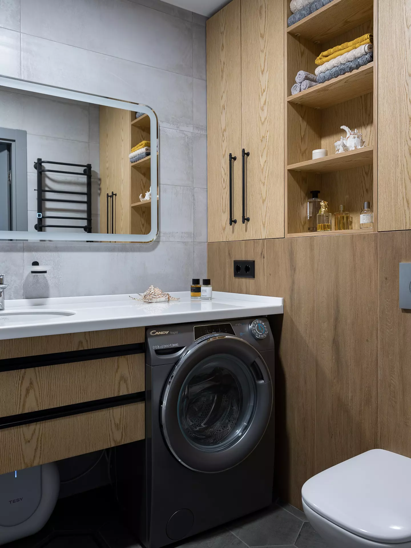
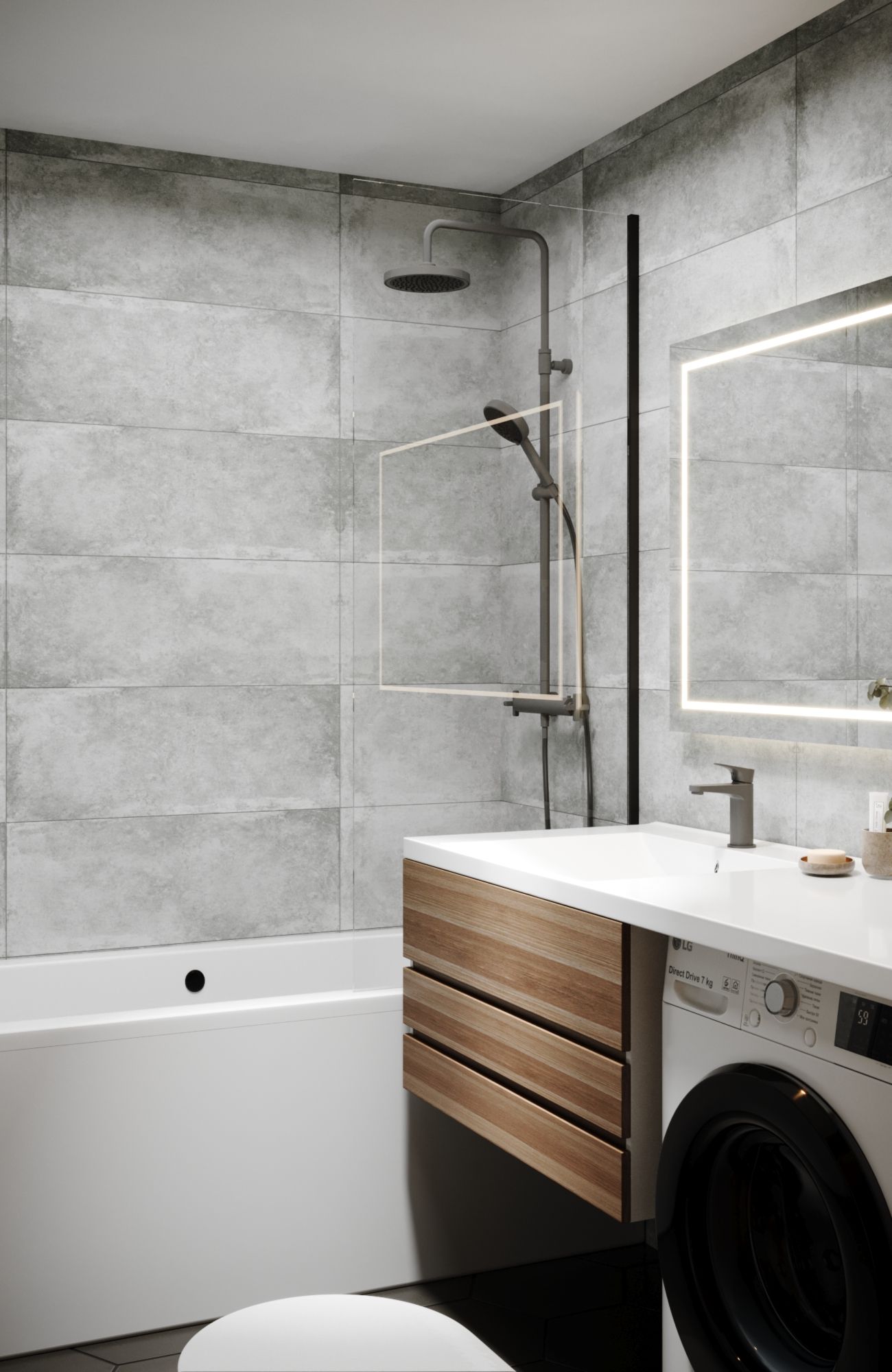
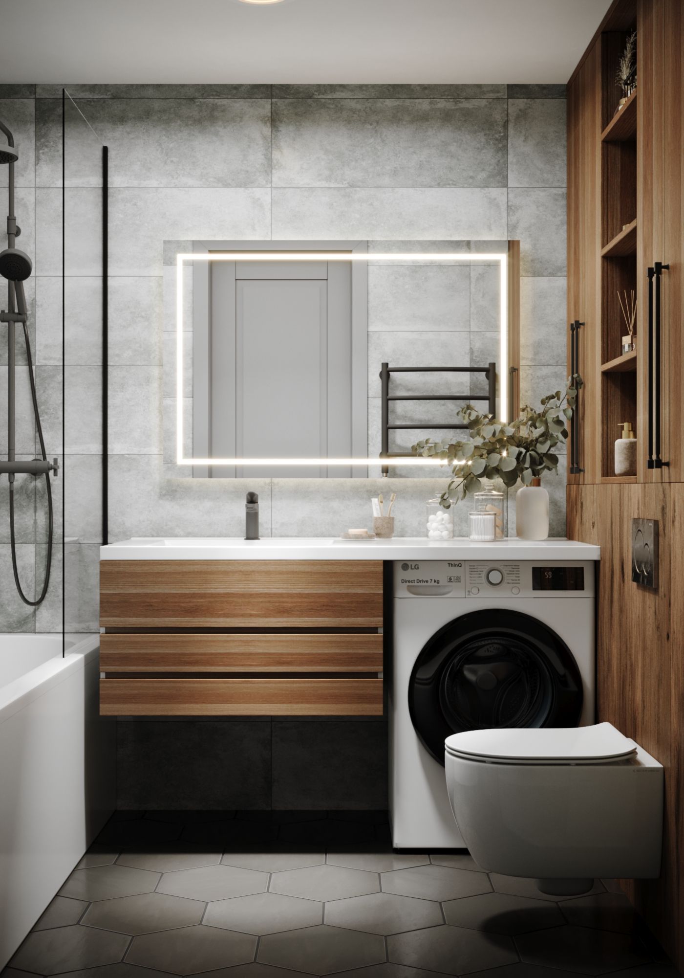
No redesign was undertaken. The objective was a swift renovation. The bathroom tiles and fixtures were kept from the original developer. The bidet was removed, a toilet was wall-mounted, and a washing machine was placed in the bathroom.
Layout Solution
The apartment follows an enfilade layout: starting with a spacious wardrobe-storage upon entrance, followed by a bathroom, and then directly leading to the kitchen. The kitchen features a peninsula that serves as a dining table and simultaneously connects the kitchen to the living area. The bedroom area is separated by a glass partition. The whole apartment is a single spacious room, functionally divided into zones. The open design means the kitchen can't be termed small. Though the kitchen space is modest, its fusion with the living room creates an open, airy atmosphere.
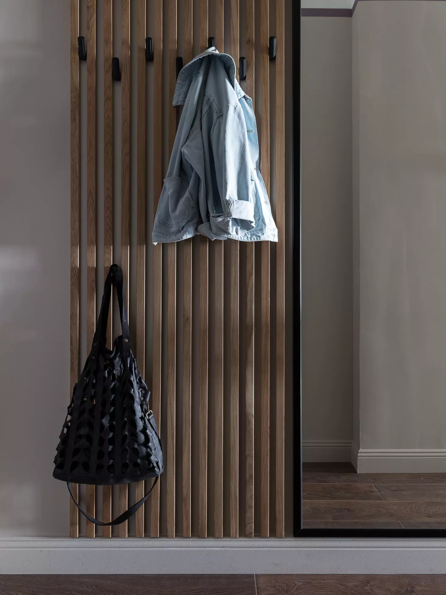
There's a wardrobe system in the storage-room. At the entrance corridor, there's a European-style dressing area with open hooks for coats or bags. A full-length mirror is installed – a must-have in hotels familiar with the essence of comfort. Adjacent to the mirror is a hanging cabinet for keys.
The kitchen has a similar open black metal shelf. All kitchen storage is neatly tucked away in cabinets. In the sleeping area, there's just space for the bed, which features a lift mechanism and soft edges.
Interior Lighting
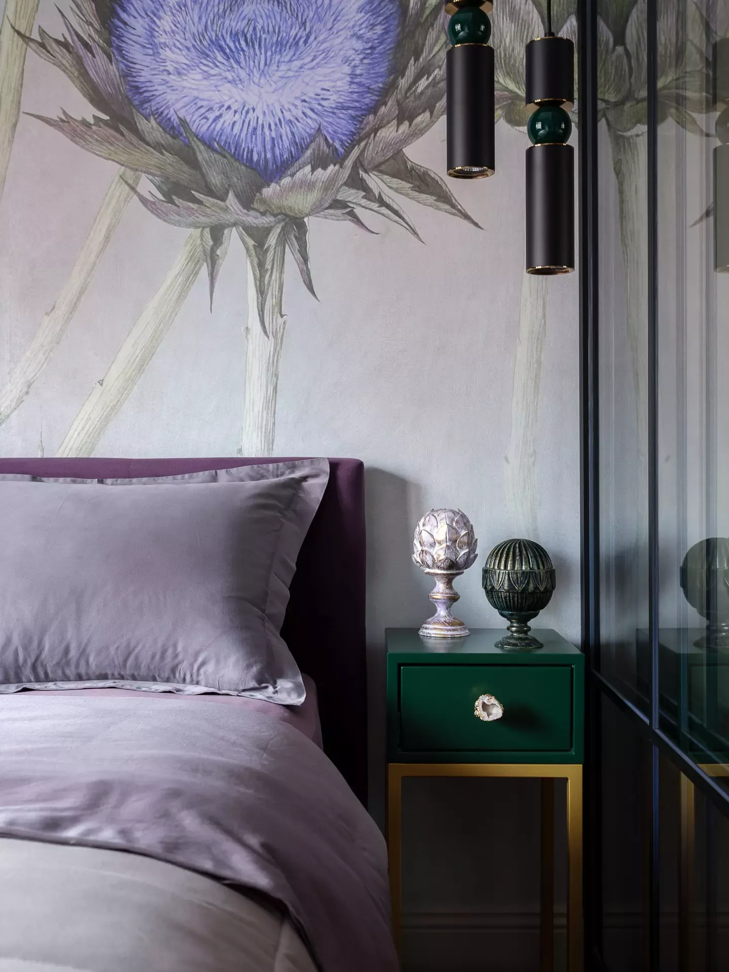
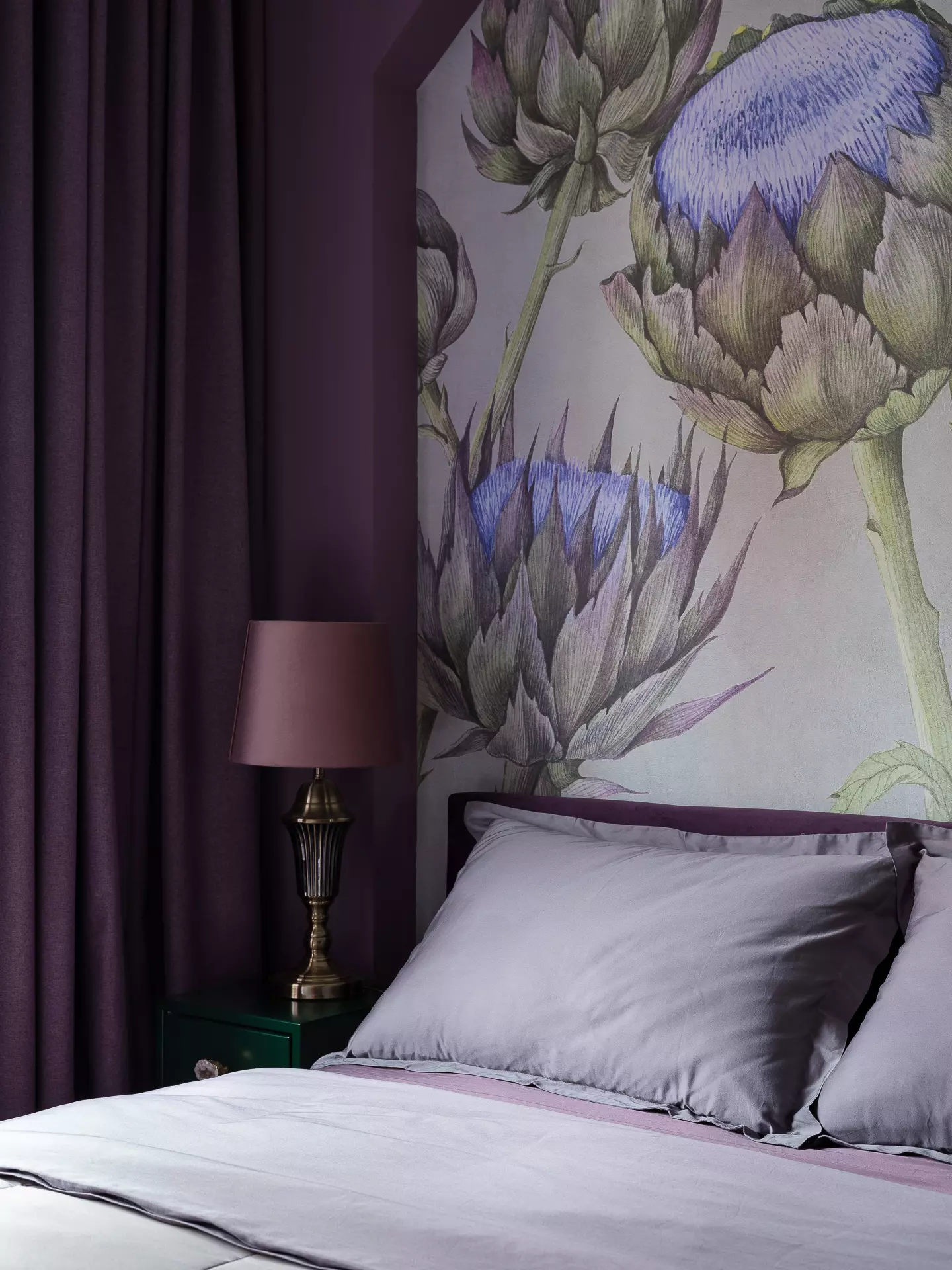
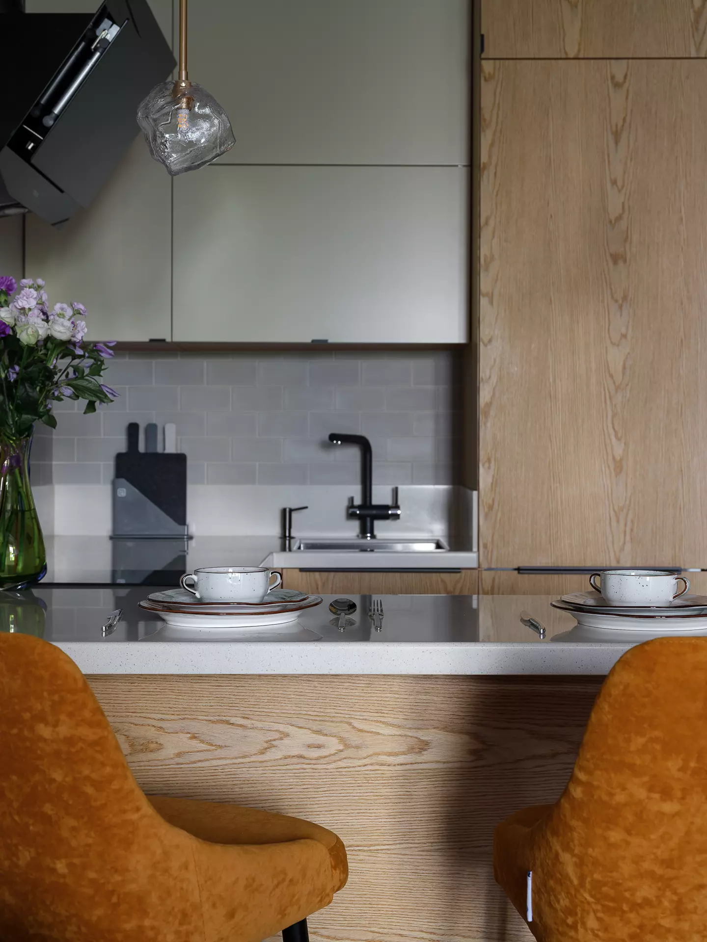
Each zone has its unique lighting accents. In the corridor, two wall sconces, resembling ice cubes, flank the bathroom door. In the kitchen, there's a lighting highlight above the table with dual suspensions, again in the ice-cube design. The living area boasts a centerpiece "icy" chandelier. These areas also have integrated overhead lighting for added brightness. The kitchen features under-cabinet lighting. The bedroom area is near the window. We skipped a predetermined chandelier connection point, opting for subdued lighting perfect for the sleeping area. We chose an amethyst-colored lampshade and two suspensions on either side of the bed with contrasting green bulbs, complementing two green nightstands whose colors precisely match the lighting fixtures.
Interior Idea and Its Colors
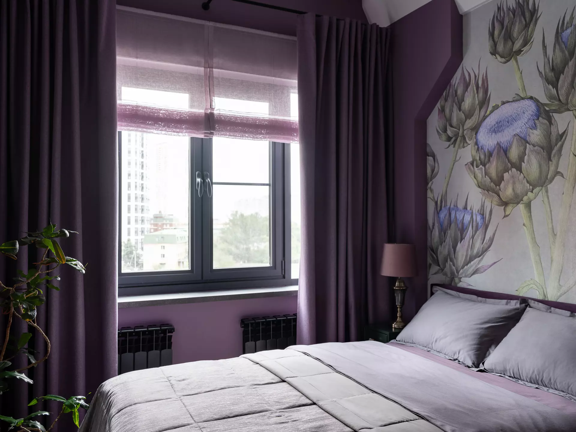
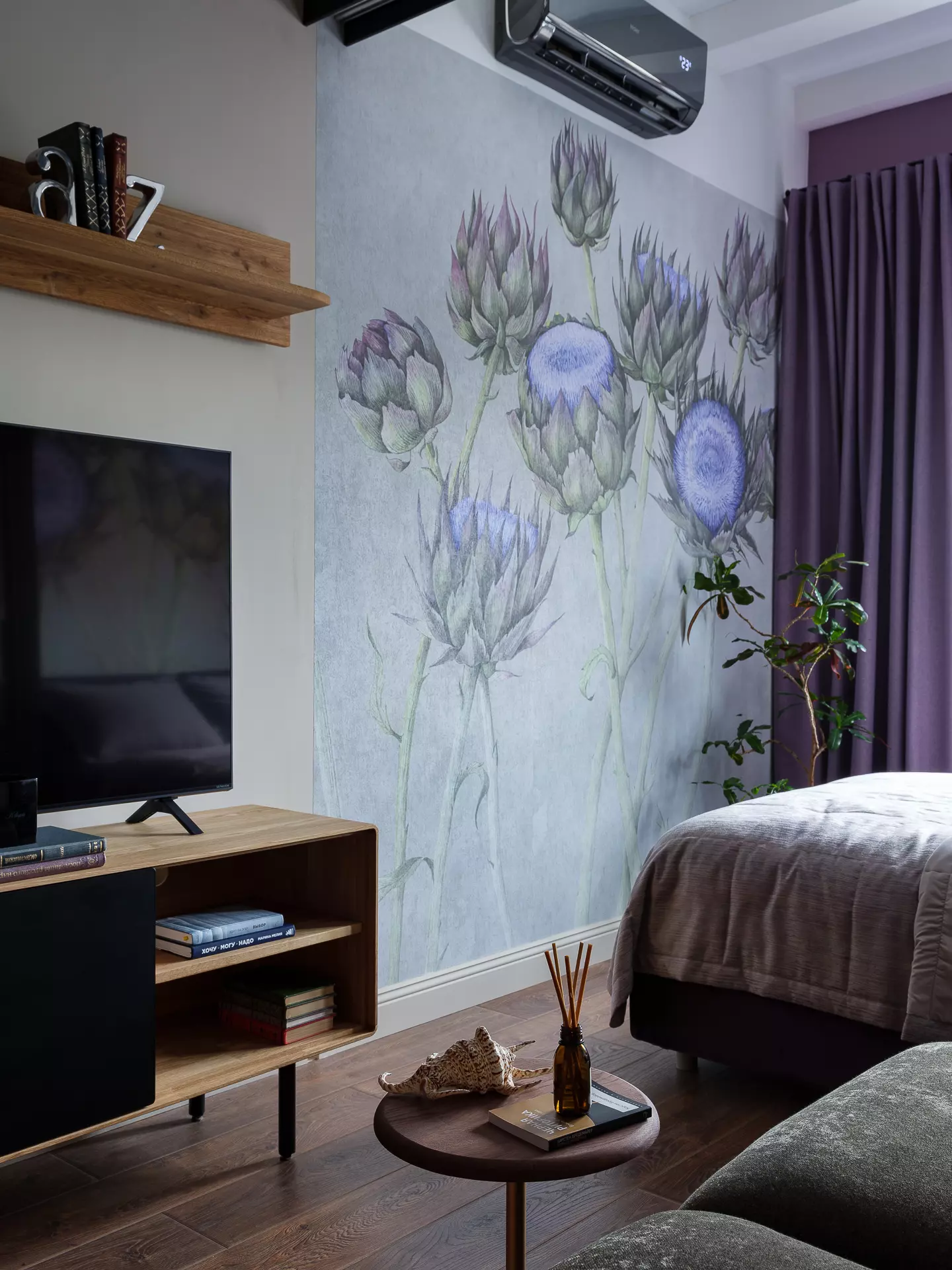
We aimed to create the effect of a floral meadow. The color palette of this interior consists of unusual vibrant colors: pink-purple, green, yellow, sandy, and orange. The eye-catching amethyst hue – a lilac-pink, is complemented by a pleasant beige-gray base color, which coats the corridor and the kitchen-living area. We utilized amethyst in the bedroom, accentuating it with frescoes depicting giant artichokes. This color is subtly present in the flowers themselves.
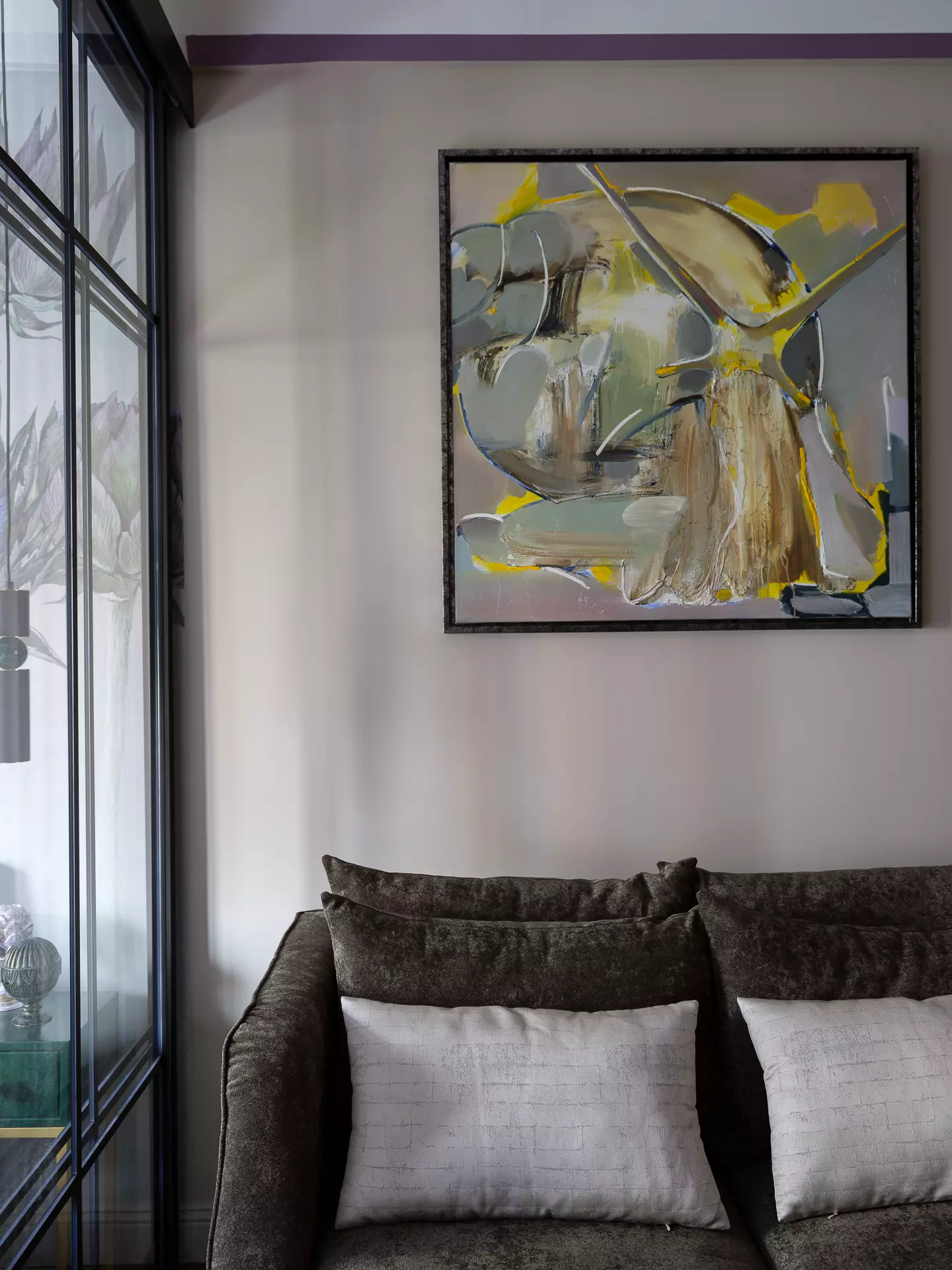
Giant flowers were intentionally chosen for the small space. They provide the necessary contrast and coziness, seemingly enlarging the bedroom. This design approach was deliberate. An amethyst stripe surrounds the apartment, where the primary wall color is beige-gray. The apartment is elongated and compact. This decorative technique visually reduces the height of the apartment, aligning its proportions more harmoniously with human scale. Well-like rooms can leave an overwhelmingly oppressive feeling. The green sofa pairs excellently with the green artichokes, giving an impression of being in a floral meadow. The orange semi-bar chairs complement the sandy oak veneer in the kitchen. The living room furniture is made of solid oak. We then introduced a contrasting yellow through a painting specially purchased for this interior by artist Ivan Fedorov. The "Snail" painting combines the interior colors and, according to its owner, represents her alter ego. The snail image resonated with the owner's feelings and experiences; she knew she had to buy it on first sight. We initially planned to complete the renovation in a few months, but it ended up taking a full year due to various challenges, including a change of construction crew, flood repairs, and more.
We chose the furniture color to harmonize with the main color scheme and match the gray tiles provided by the developer, which we decided to keep. The oak veneer color blends perfectly with the gray.
Curtains
There's only one window, facing the sunny south side. Semi-transparent Roman blinds were ordered for diffused light. For comfortable sleep, blackout curtains, close in color to amethyst, were hung to maintain the room's height. The round metal curtain rod is mounted close to a structural beam, which can't be removed or bypassed. Without this beam, we would have placed the curtains higher.
Interior Style
The style is a mix of contemporary minimalism and Art Deco. We have modern furniture with simple geometric shapes. For the custom-made furniture, we matched handles: neutral black handles for the kitchen as the appliances are black, and for the green bedside tables, we and the client specially found golden amethyst handles. Modern minimalist furniture from Archpole in black fits seamlessly into the overall style. All decorative lighting has either gold or black details. The whimsical shape of the lampshades, resembling ice chunks, lends grandeur to this interior.
Materials
Walls: Lanors Mons paint, Factura ARTICHOKE/1 wallpaper, Kerama Marazzi SG522900R Salvetti ceramic granite, size 30x119.5 cm; Kerama Marazzi 7.4x15 Torotona beige ceramic tiles.
Floor: Tarkett laminate
Sanitaryware: Jakob Delafon (toilet, sink, bathtub curtain), EWRIKA Safo D Electric Towel Warmer 60x50 L in matte black; DIWO Dmitrov Mirror 120 with illumination, dimensions 1200x30x800 mm
Soft Furniture: MDhouse sofa, Askona bed
Fitted Furniture: Kitchen, bathroom cabinet, and sink unit, bedside cabinets, entrance hall with mirror - Rabbit; TV stand, shelf above TV, shelving unit - Belfan
Entrance shelving: Elfa
Entrance shelf: Archpole Bedside Shelf <GRID> in black metal (key holder shelf), dimensions 350x400x300 mm
Kitchen shelf: Archpole Kitchen Shelf <WOUNDED SPY> in black, 600x600x100, metal finish in black
Lighting: Odeon Light
Electrical fittings: Werkel Snab in black
Photography by: Evgeny Gnesin
Interested in a similar design? FILL OUT THE FORM to order your personalized interior design project.


