Apartment Reconstruction in Hollywood Color Core
Property Type and Series
This apartment is located on the top floor of a multi-sectional building of Series II 29 with load-bearing brick walls. It's a Stalin-era building with ceiling heights measuring 2.55-2.40 meters according to laser measurements. The apartment's area according to BTI is 44 square meters. We've transformed it into a modern living space tailored to a young individual and their interests.
Subscribe to our TELEGRAM channel for updates.

Apartment layout according to BTI plan

Measurements were taken after demolition.
Budget
Initially, the client set a budget of 2.5 million rubles excluding construction work. This budget covered designer items, finishing materials, furniture, lighting, and plumbing fixtures.
Interior Concept
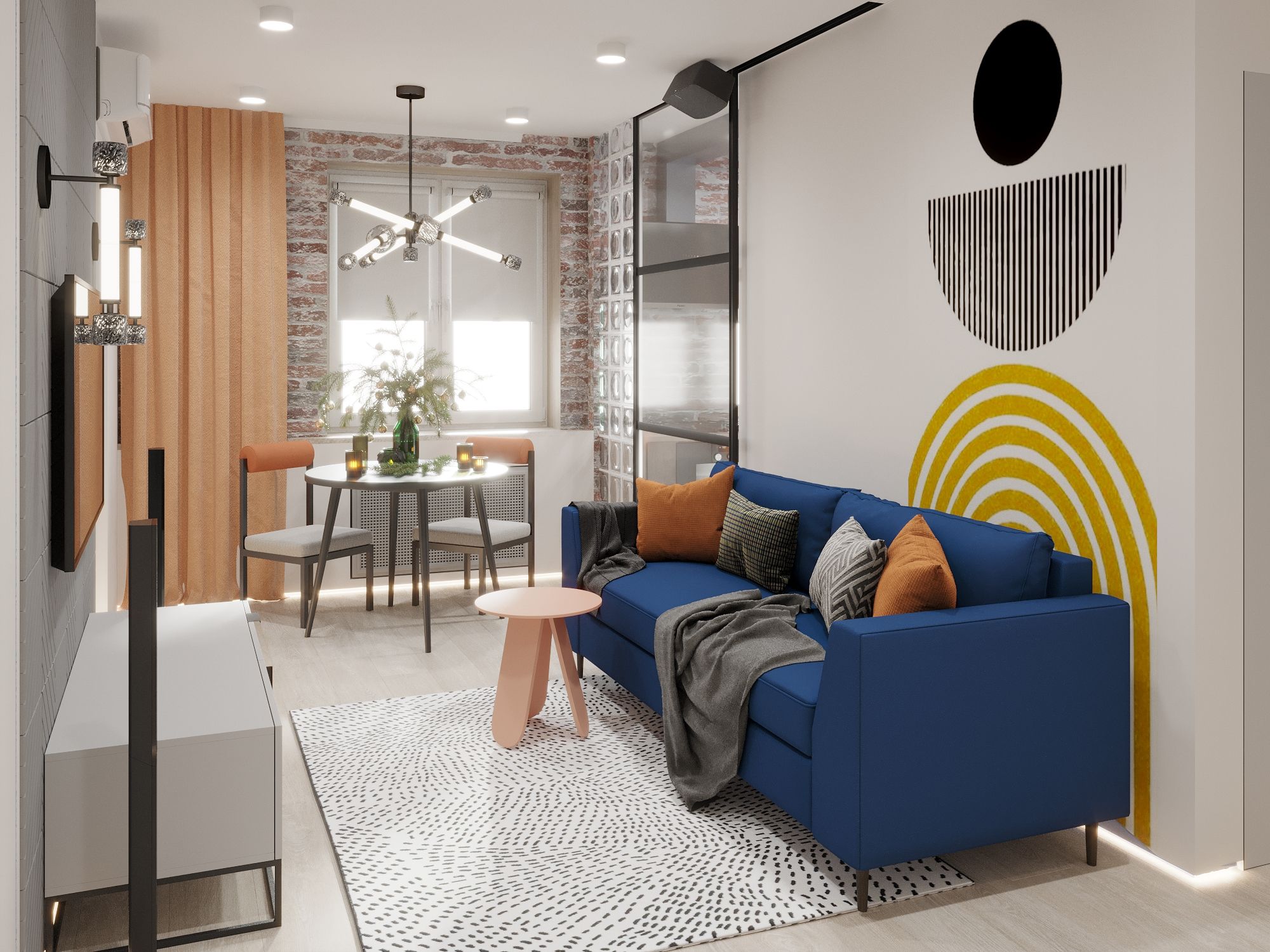
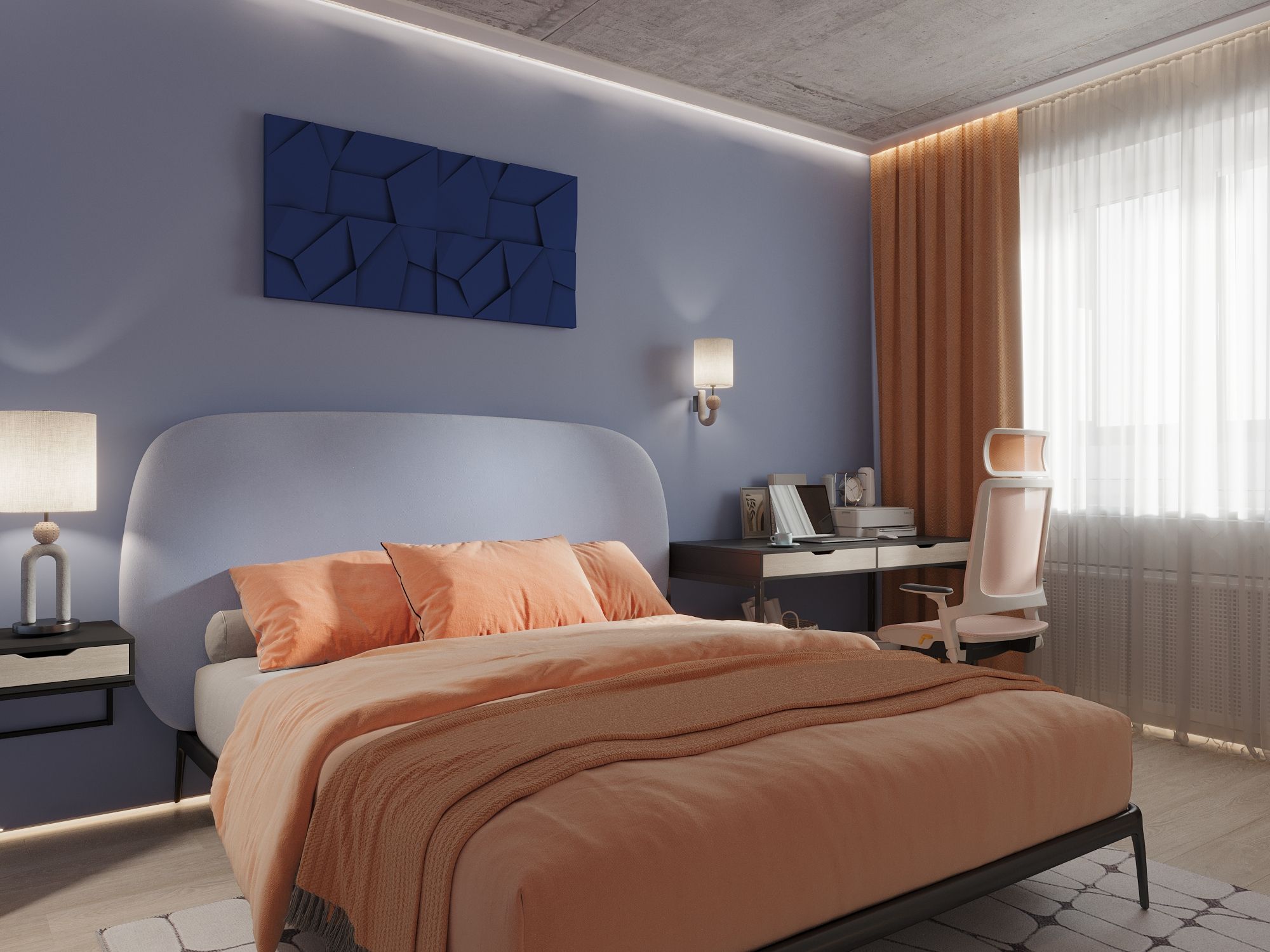
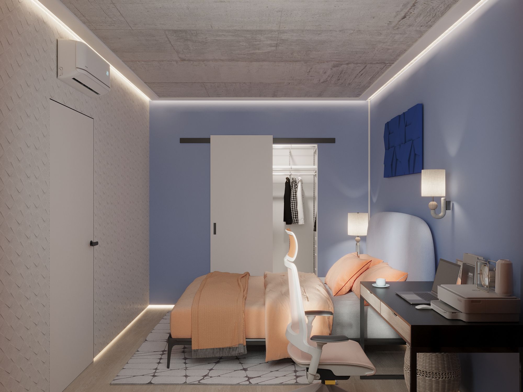
The interior concept was inspired by the client, Pavel. He envisioned a modern interior with loft-style elements. Hence, we preserved the brickwork on one of the walls with windows and the concrete ceiling in the bedroom.
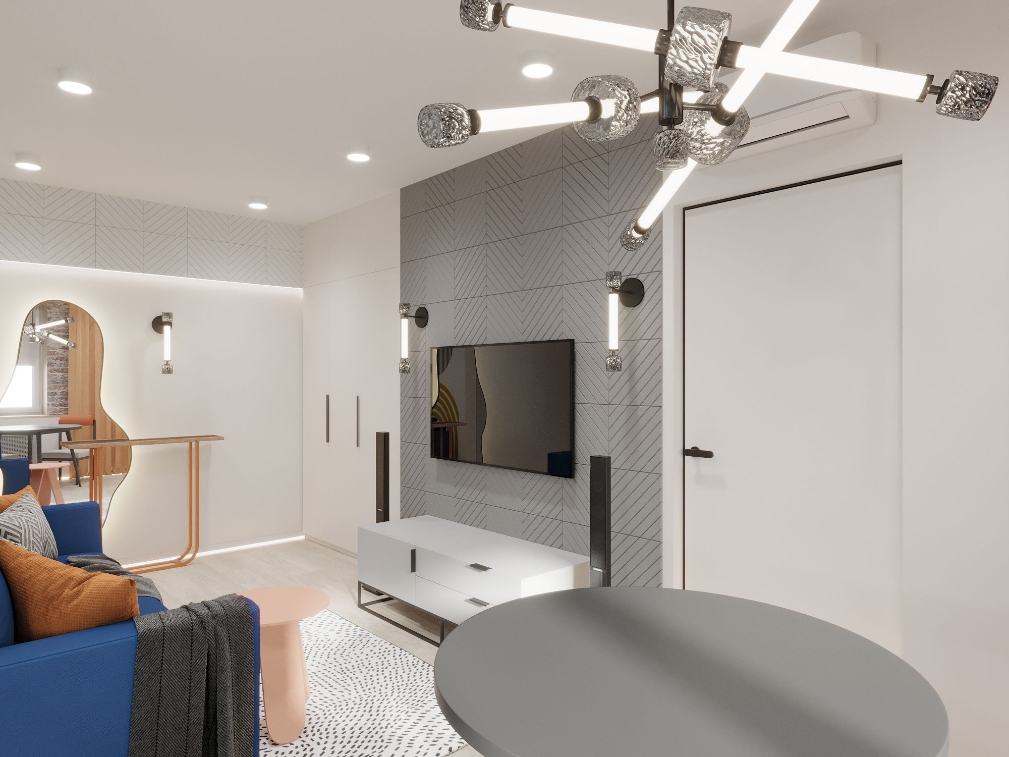
The interior design stemmed from the architecture of the apartment, incorporating Pavel's requests for soundproofing from neighbors, a home theater in the living room, and ample kitchen storage.
Before the project commenced, each client fills out a questionnaire. Pavel approached this technical aspect creatively. I appreciated his openness and trust, qualities I highly value in those who seek my services.
From the Questionnaire: Hobbies and Family Members' Interests, necessitating the accommodation of specific items (collections, large sports equipment, musical or technical instruments) within the home;
Pavel: I have a unicycle, which I usually place in the hallway, and perhaps a scooter might join it. There's a small collection of musical instruments—guitar and violin. I also have some technical tools, but I thought of simply buying a box for them and storing them in the walk-in closet. Sometimes, I sew using a sewing machine, so I need a large table for cutting patterns and to set up the machine.
From the Questionnaire: Guests - frequency, number, duration. Is there a need for additional seating and sleeping arrangements, storage space, towel racks, and shelves in the bathroom?
Pavel: This is the highlight of the program—the apartment's primary purpose is to gather with friends. The initial plan is to install a home theater in the living room, with a sofa that can double as a bed if needed. Guests typically come every couple of weeks, but sometimes someone might stay for a month or two. In general, if any of my friends need to stay over, I want to be prepared for that possibility.
From the Questionnaire: Intended occupants of the apartment.
Pavel: Male, 29 years old. Currently single, perhaps a girlfriend might appear in the future, but it's hard to predict.
From the Questionnaire: Specific client preferences regarding spatial planning solutions (interconnected rooms, their transformation).
Pavel: Alright, great question. I'd like to turn the balcony into a study, but it requires an extension of the slab, so if you have contacts for assessing the balcony's condition and carrying out the extension, that would be awesome. A walk-in closet is definitely needed because I dislike those huge wardrobes in bedrooms, they give me shivers. A bedroom is necessary. And the main room—it's the kitchen-living room with a home theater because I really love movies, and a significant amount of funds will be invested in the home theater.
We started with the kitchen and the bedroom, creating a collage with the help of AI.

Initial kitchen collage created with AI
About Demolition
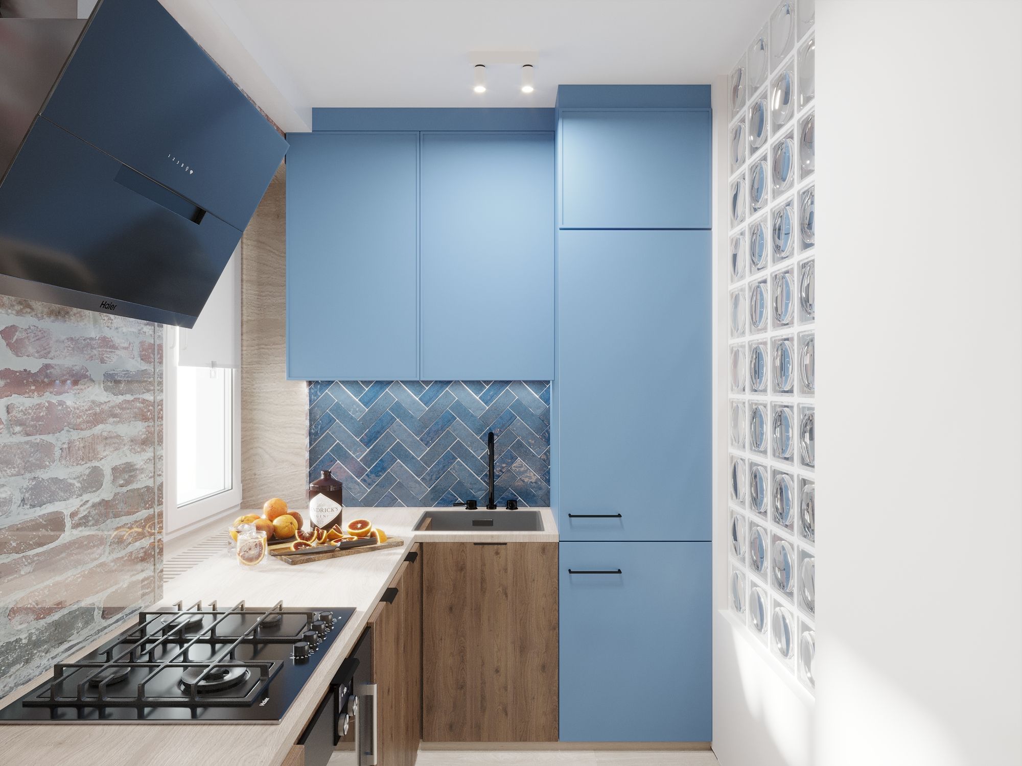
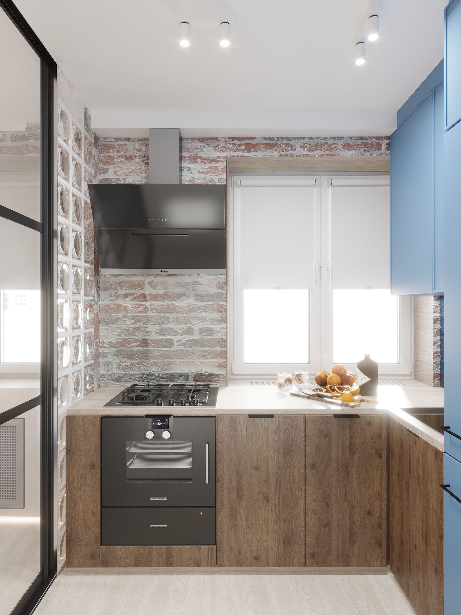
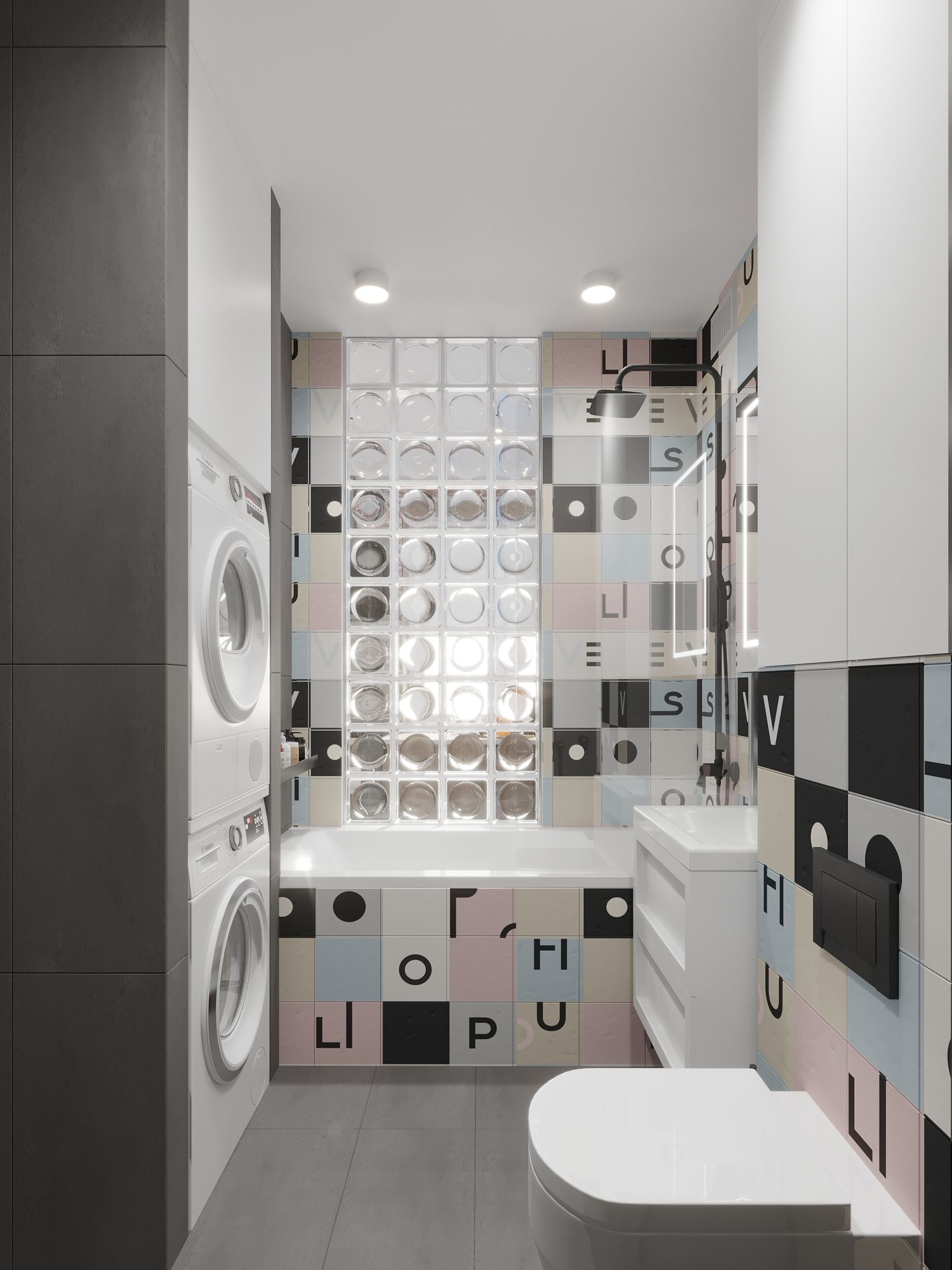
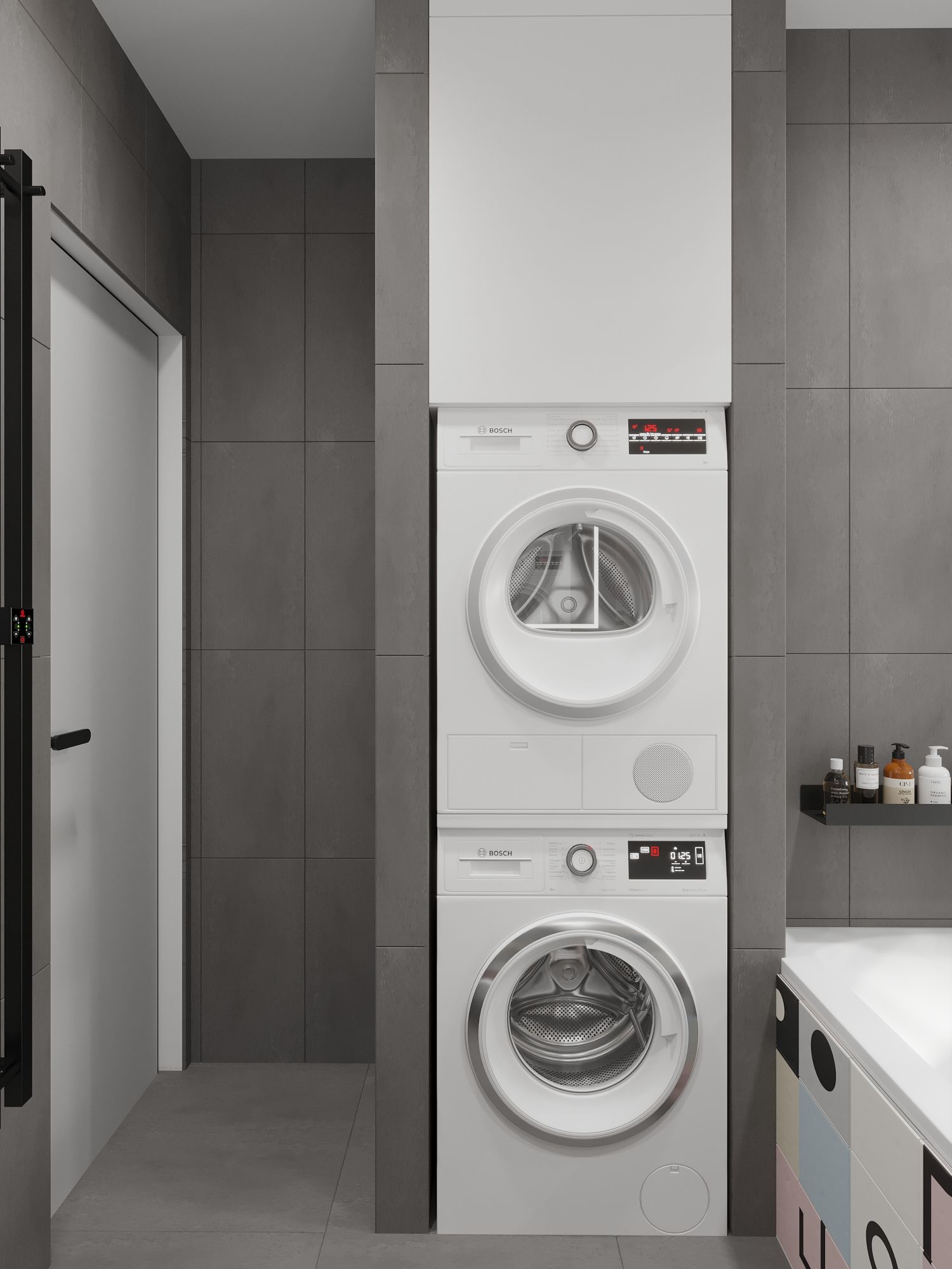
Pavel completed the entire demolition process before the measurement work. All non-load-bearing walls were removed from the apartment. The redesign was done with the intention of legalizing it. There's gas in the kitchen, hence the glass door between the kitchen and the living room. The kitchen doesn't exceed its dimensions. However, the bathroom had to be expanded at the expense of the kitchen and the corridor because the required set of appliances and plumbing couldn't fit there. The bedroom was reduced because a diameter of 2.4 m is needed for the theater. A walk-in closet was allocated in the bedroom. Unfortunately, it wasn't possible to place a workstation on the balcony—it's too small.
Materials
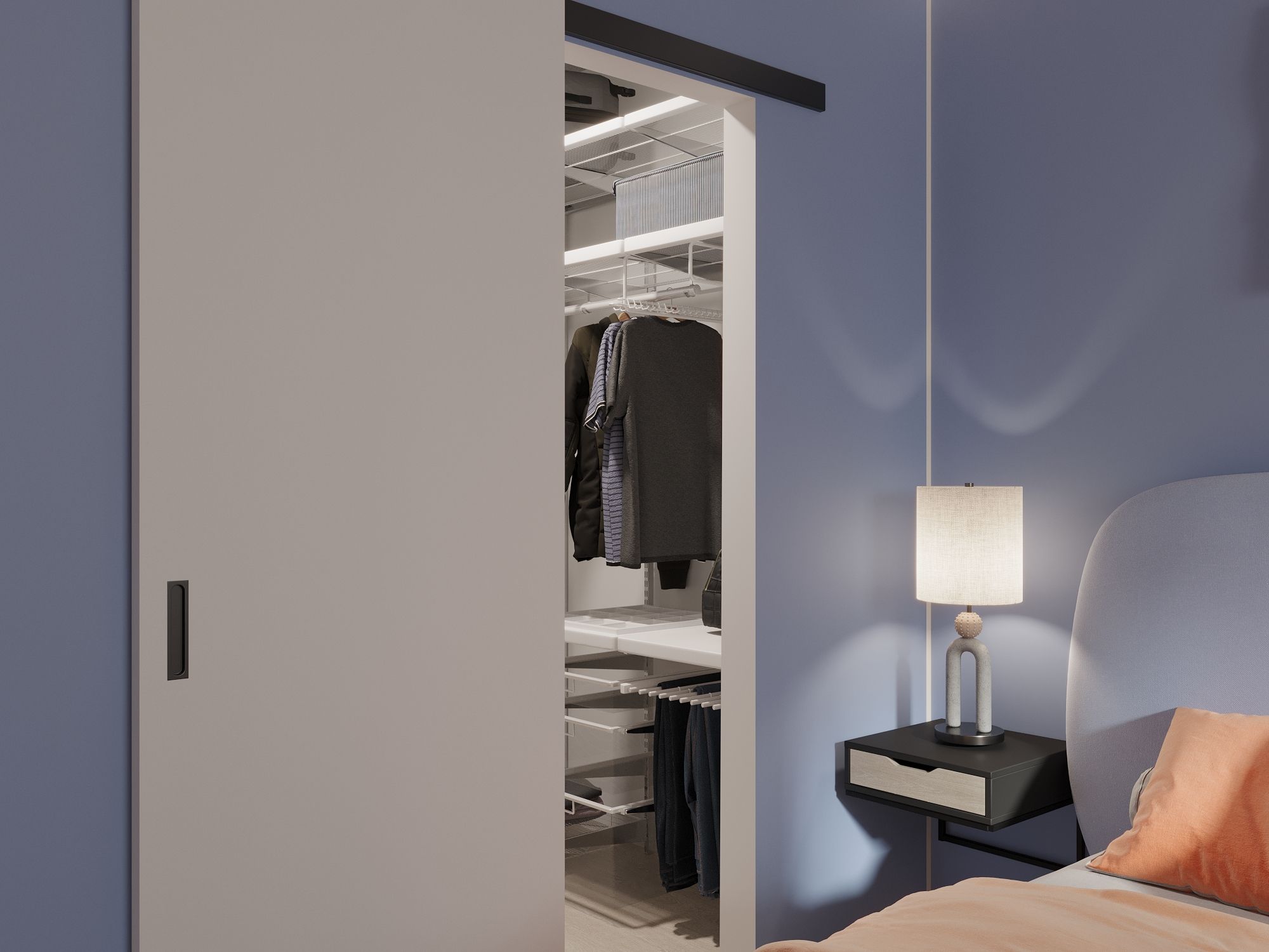
We aimed to create a modern apartment with mostly painted walls. In the bedroom, we applied wallpaper on several walls to break the monotony of blue, which complements orange, following the Hollywood color grading concept. In the living room, behind the television, we used acoustic panels made of felt and perforated acoustic plasterboard. We also hung curtains over the window for the same purpose. We suggested gathering the curtain to one side of the window to balance it compositionally on the wall.

Plan after redesign
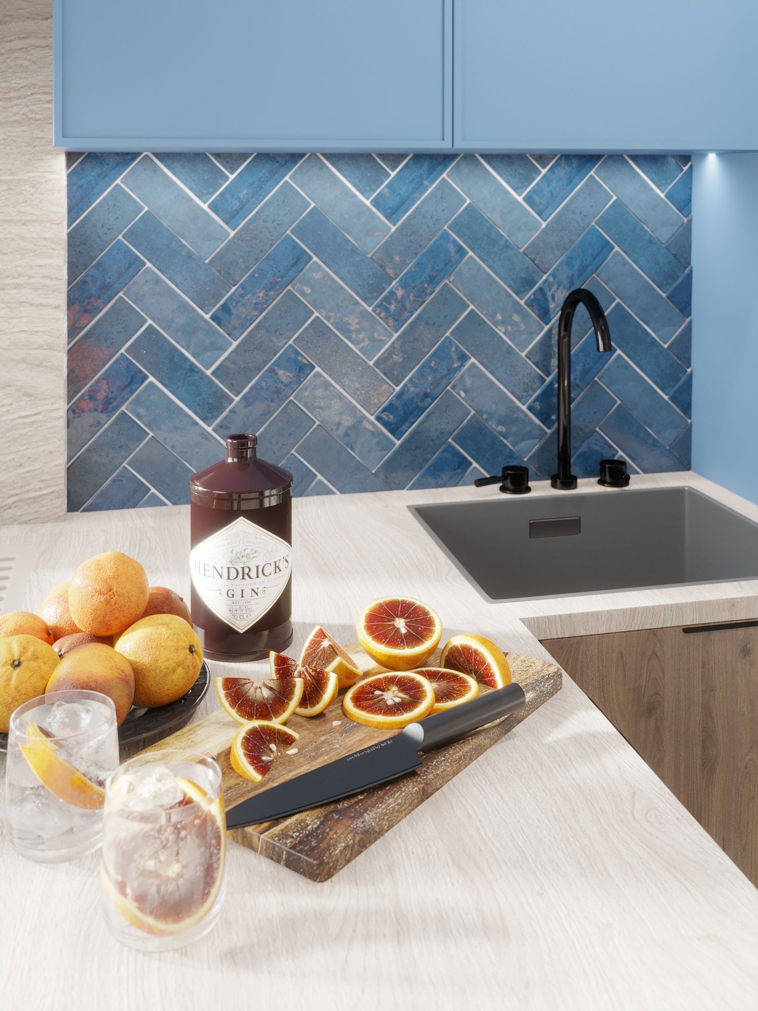
A window made of glass blocks leads from the kitchen to the bathroom. For this reason, the kitchen set is built along the wall with the window. The stove is placed in a niche where the previous owners removed the brickwork, creating a recess for the television. We cover it up in the project. Such recesses are prohibited as they can compromise structural integrity.

Fragment of the kitchen plan

Fragment of the bathroom plan
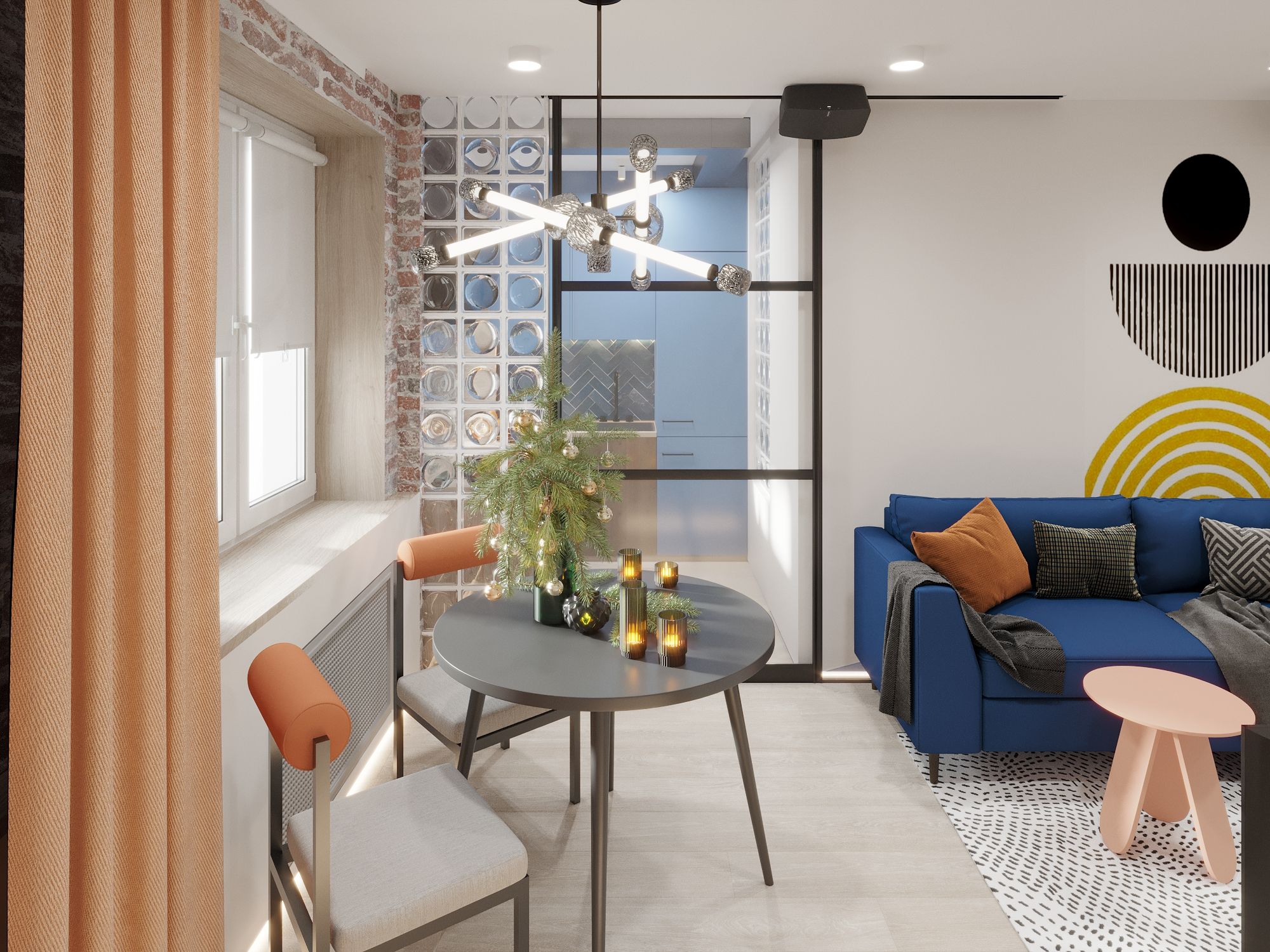
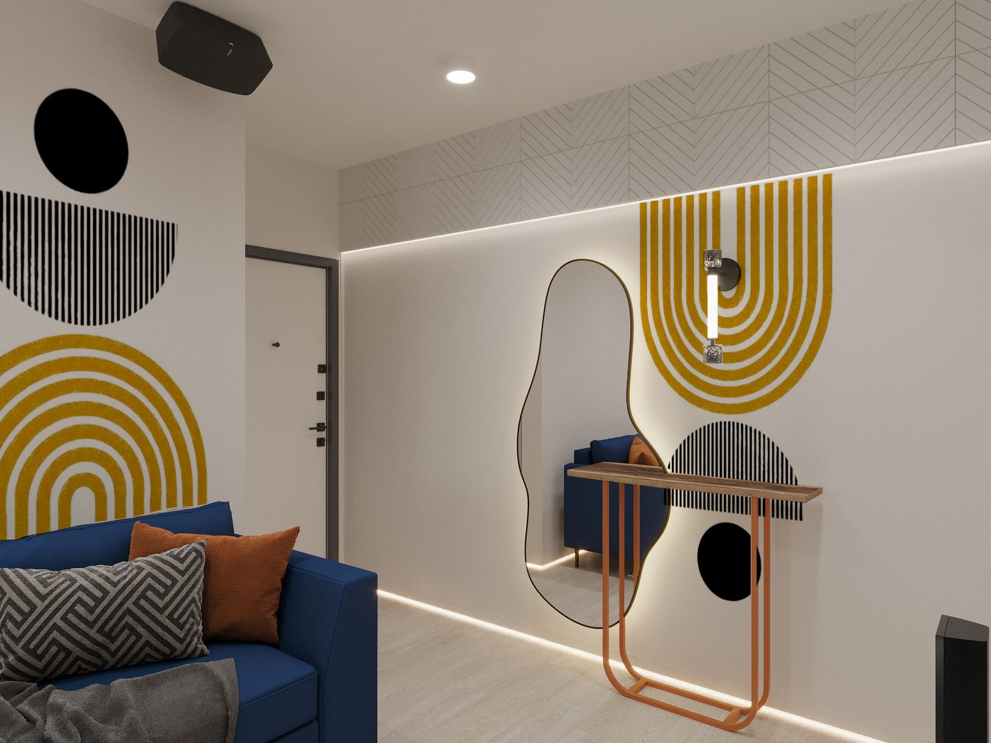
In the living room, behind the sofa, there's a retro-futuristic-style drawing. The same pattern, inverted, is near the console with the mirror.
The blue sofa color continues throughout the project. However, since the apartment is small and designed in a modern Euro-style studio format, most of its walls are light. This is intentional. We used the properties of light shades to expand the space.
Storage
The client was against any cabinets. Nevertheless, one built-in wardrobe appeared in the apartment. Items hung openly, and since our hallway and living room are combined, they make the space less tidy than when they are stored in a closet. There's also a convenient walk-in closet for storage items from the bedroom.

Fragment of the hallway plan with a built-in wardrobe
Lighting
We always approach lighting selection very responsibly. We want there to be plenty of light, and it to be varied. We use backlighting, chandeliers, wall sconces, and technical lighting. We strive to do this in every project. Lighting in the bedroom, where the ceiling is a concrete slab, is achieved through powerful perimeter lighting in the cornice. Accent lighting is achieved with interesting "playful" wall sconces and a table lamp from the same collection, assembled as if from geometric primitives.
In the living room, the main accent is the chandelier above the table. In addition to it, there are wall sconces by the TV and above the console.
Throughout the apartment, there is a shadow skirting board with lighting designed.
Colors
Also, during the color preference identification, the client liked the blue color. Discussing color schemes and which combinations to propose with blue, Pavel and I settled on the Hollywood color grading.
What is Hollywood color grading?
It's an intentional "enhancement" of colors, allowing for an impressive effect simply through skillful selection of paints. The story begins with the Impressionists. In 1888, Claude Monet wrote: "Colors gain by contrast what they lose by their natural properties. Primary colors look brighter when they contrast with their complementary opponents." The theory of color was eagerly used by Renoir and Van Gogh. They were followed by graphic designers. And later - by the creators of cinema (not for nothing, for example, coloring the lenses of anaglyph 3D glasses red and green). The combination of blue and orange always produces a wow effect. You can assess it yourself.
All furniture, plumbing, and lighting were chosen to fit within the client's specified budget and the chosen modern Neo-Memphis style with futuristic elements. The table and sofa fold out. Spare chairs can be stored in the walk-in closet. For the bedroom, we chose furniture from the Arxpole brand for its restrained minimalism. In the living room, there's a console from SK design.
Roller blinds are hung on the windows to protect from the sun. Long blackout curtains are in the bedroom and living room. In the bedroom, they are for comfortable sleep. In the living room, for a comfortable movie session.
Style
The interior style is Neo-Memphis with elements of retro-futurism. The latter is evident in the drawings in the living room and in the mirror shape resembling a puddle. Neo-Memphis is a "playful" style derived from modernism, with strict geometric shapes and lines. There are many such forms and lines here.
It was challenging for Pavel to purchase the bathtub before the start of renovation because the apartment needed to be lived in for some time after demolition. We simply miscalculated slightly. The bathtub was purchased before the measurements were taken, and the initial planning was done according to the BTI. We chose a convenient large bathtub measuring 170x80 cm, hoping it would fit. The apartment turned out to be smaller in reality. We had to fit the purchased bathtub into the space. Before the renovation, there was a bathtub measuring 150 cm in the apartment. Initially, we wanted to move the refrigerator into the niche next to the bathtub, creating more workspace and a more convenient kitchen work triangle.

Proposed preliminary layout of the apartment before measurements
CONTACT US on Telegram or WhatsApp for a free consultation.
Lead Designer: Ekaterina Proskurina
Designer: Anastasia Yarmina
3D: Karina Mazukova
Architect: Elena Nazarova


