Bipolar Chic: A Home Built Around Opposites
Classic and contemporary, restrained and theatrical, calm natural shades and vivid blocks of colour—this apartment is shaped by the meeting of opposites. The client herself described the design as “bipolar.” We turned that phrase into the project’s central concept: instead of smoothing out the differences between the family members, we created a home in which everyone has their own visual and emotional territory.
I’m Ekaterina Proskurina, an architect and interior designer. I help you plan your child’s room before renovation begins—accurately, comfortably and with their age and gender in mind.
My services offer a practical alternative to a full interior design project. Your complete plan will be ready within 7–10 days, with prices starting from RUB 24,990 per service. Find more information on the Services page.
Subscribe to my Telegram channel, where I share practical advice on creating a truly comfortable home.
The owners
This 115.85-square-metre apartment was designed for a family of three: a couple and their school-age or teenage child.
[Insert the owners’ age range and occupations.]
The couple had very different ideas about personal comfort. She wanted colour, pattern, intricate detailing, expressive furniture and an almost fantastical atmosphere. His side of the apartment, by contrast, needed to feel calm, functional and visually disciplined, without excessive decoration.
The key request was not to dilute either personality in search of a safe compromise. As a result, the apartment does not follow a single stylistic formula. The shared rooms connect the two characters, while the private spaces allow each owner to remain firmly at their own end of the spectrum.
Functional objectives
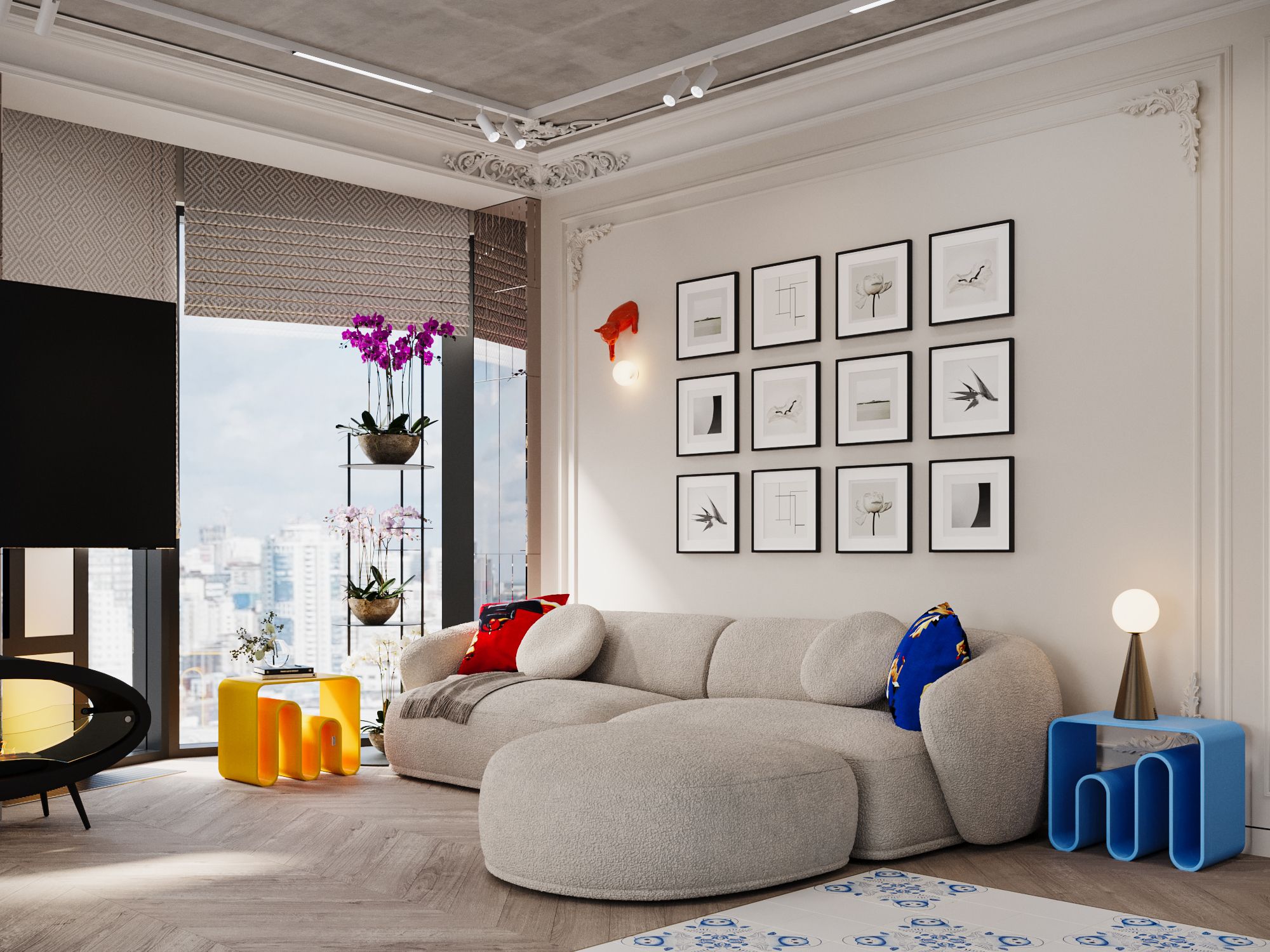
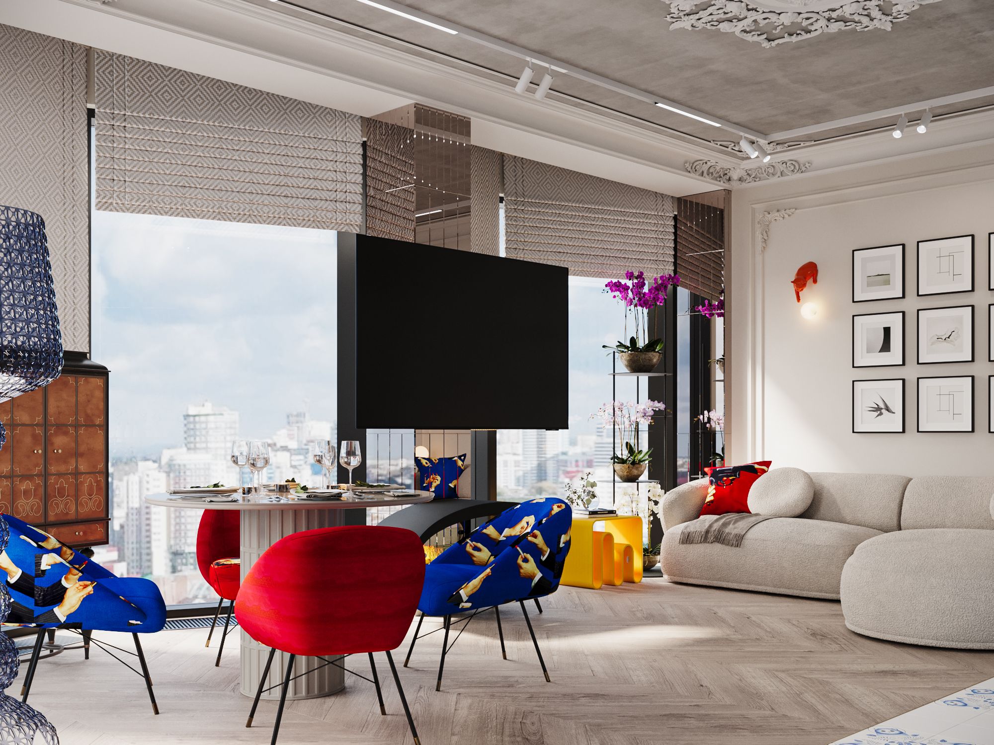
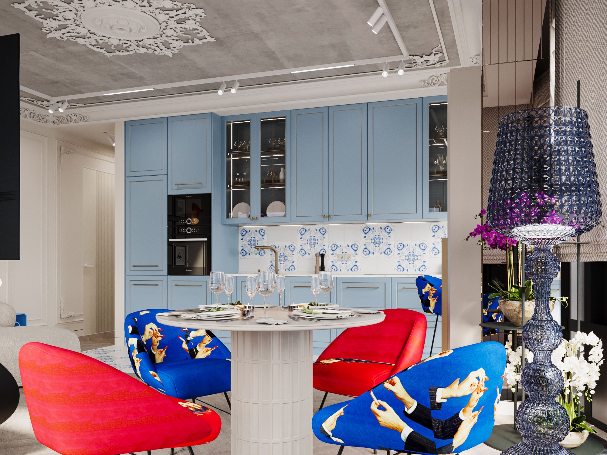
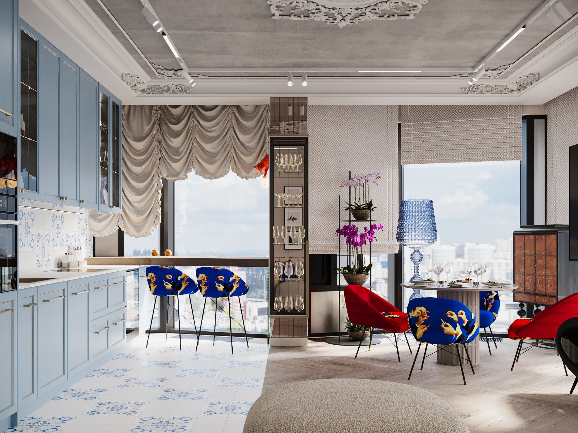
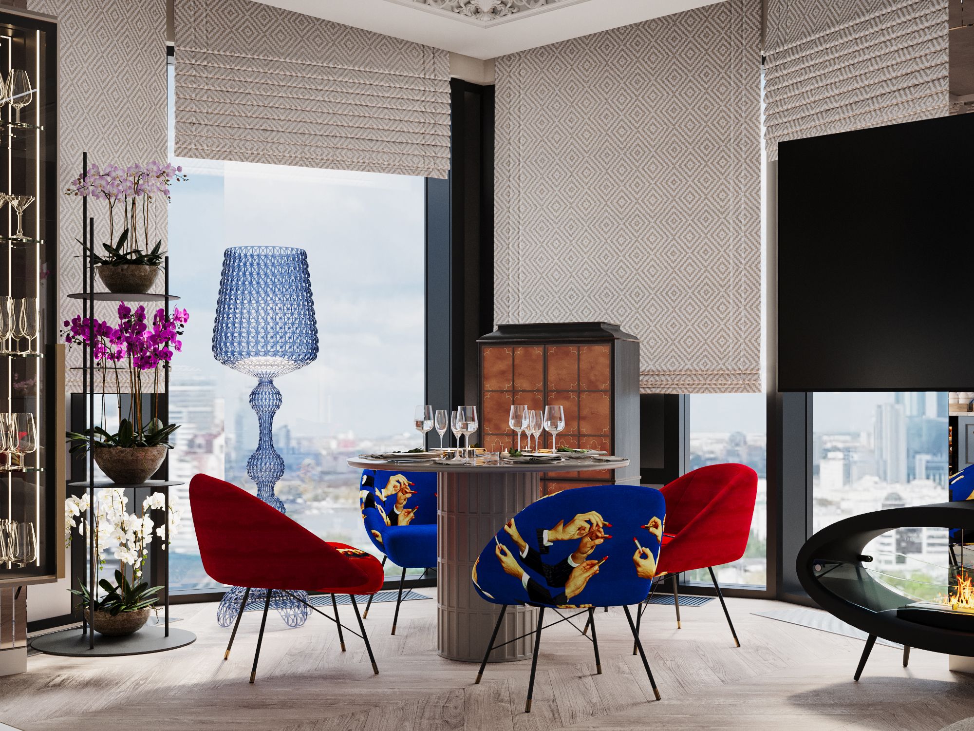
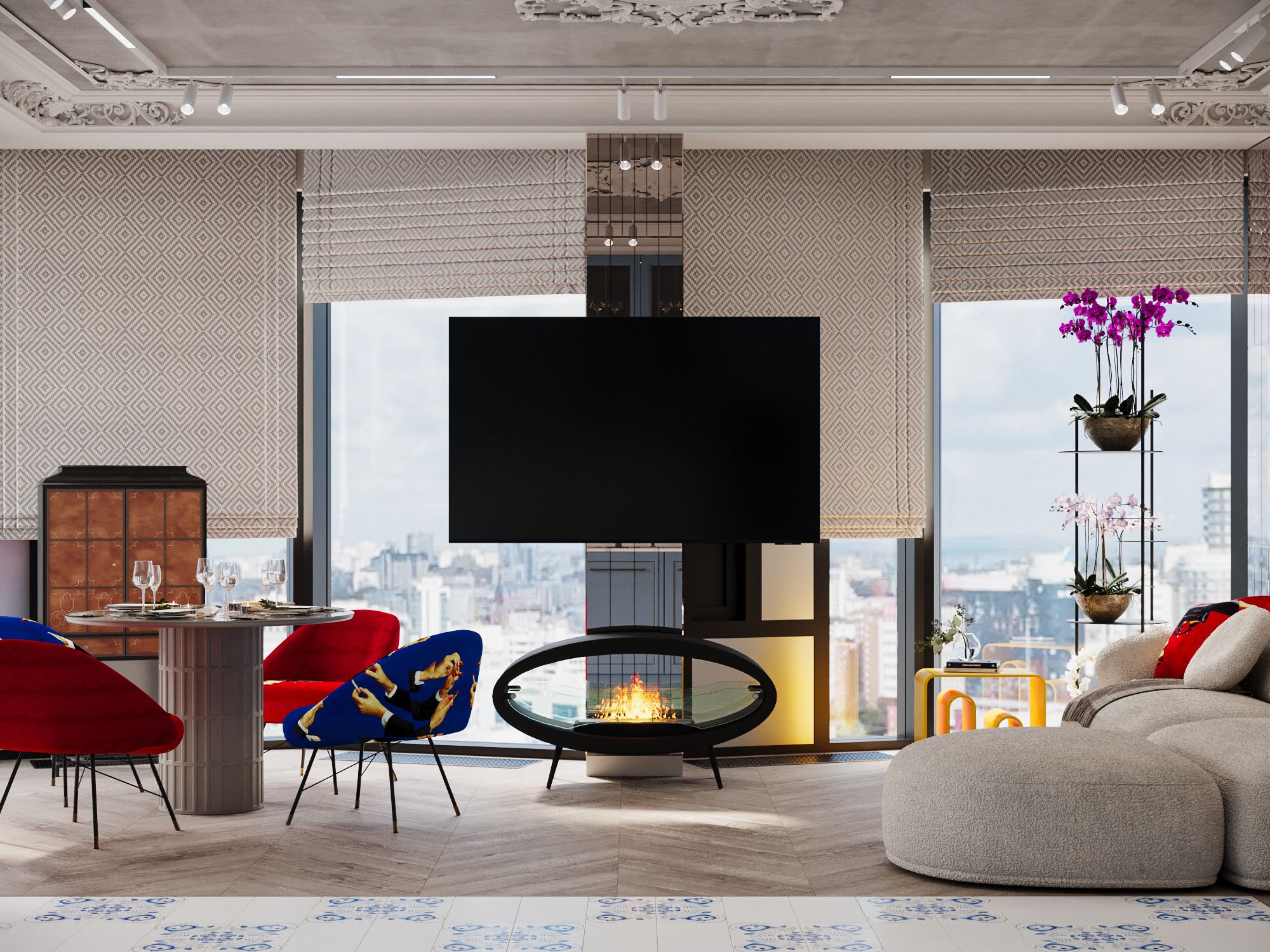
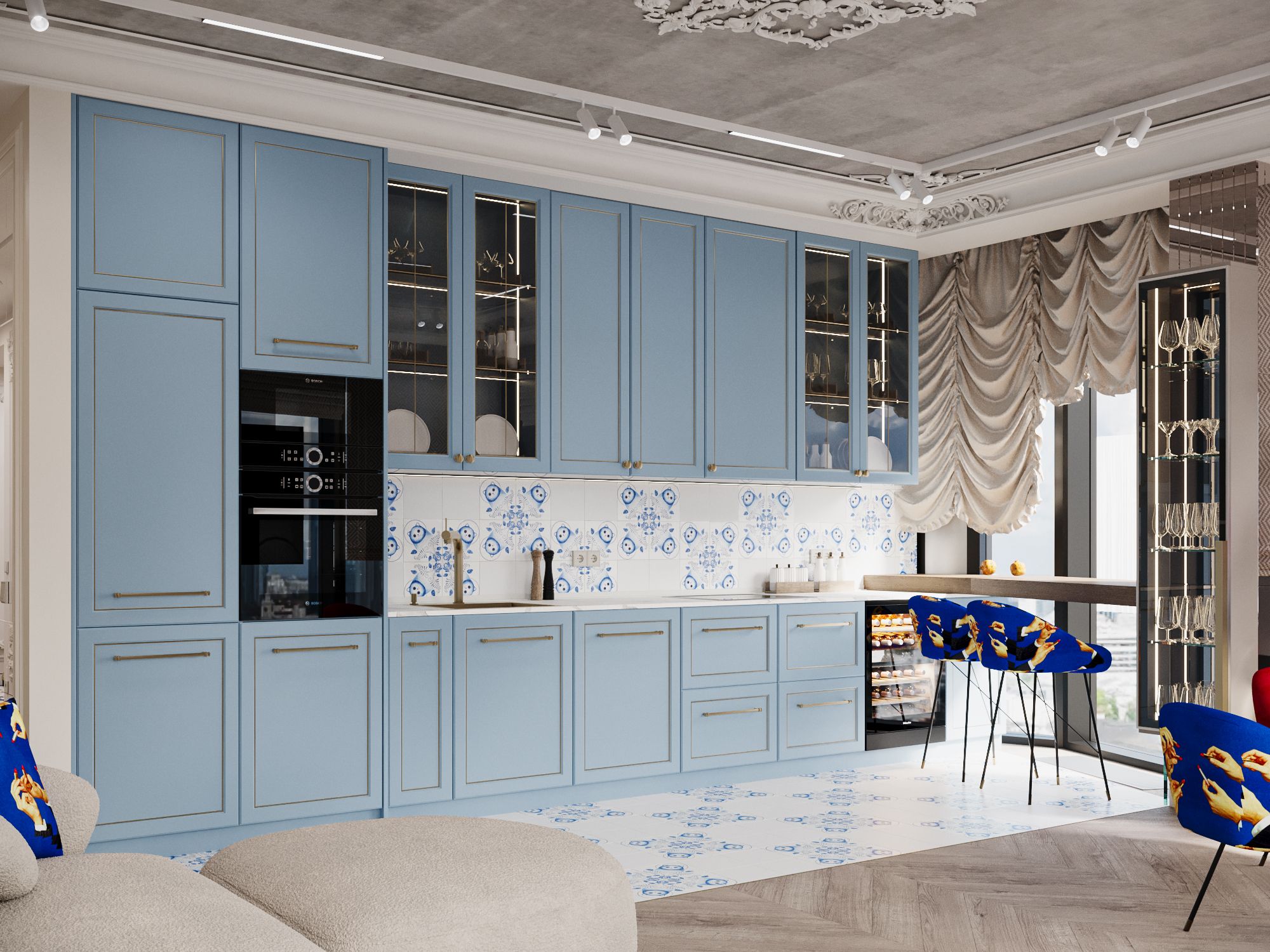
The layout is organised around a spacious kitchen and living area of approximately 35 square metres. It serves as the social heart of the apartment—a place for everyday relaxation, family meals and entertaining. The kitchen runs along one wall and includes a peninsula, while the dining and seating areas face the panoramic windows.
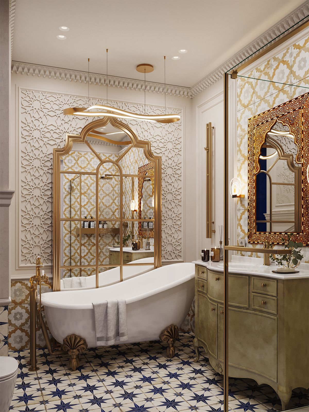
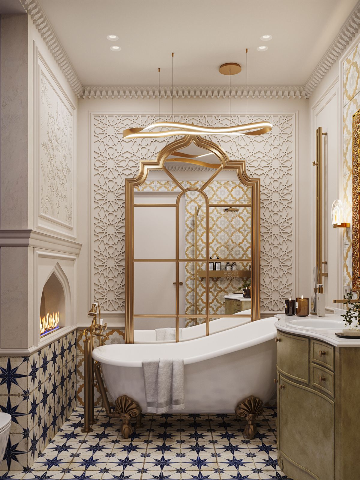
The couple have separate bedrooms and bathrooms. Her bedroom is complemented by a large bathroom with a freestanding tub, while his room has its own compact shower room. This arrangement accommodates different routines, habits and expectations of privacy.
The apartment also includes a child’s bedroom, a generous entrance hall and extensive built-in storage. We developed alternative furniture layouts for the child’s room so that it can adapt as its occupant grows.
Despite the apartment’s substantial area, the planning remains efficient: the private rooms are not used as passageways, and the shared, children’s and adults’ zones are clearly defined.
Renovation and materials
Materials were selected to balance expressive texture with everyday practicality.
In the main living area, timber flooring is paired with porcelain tile. The ceramic surface defines and protects the busiest part of the kitchen, while also functioning as a decorative rug. The timber floor brings warmth to the living area and creates a visual connection with the bedrooms.
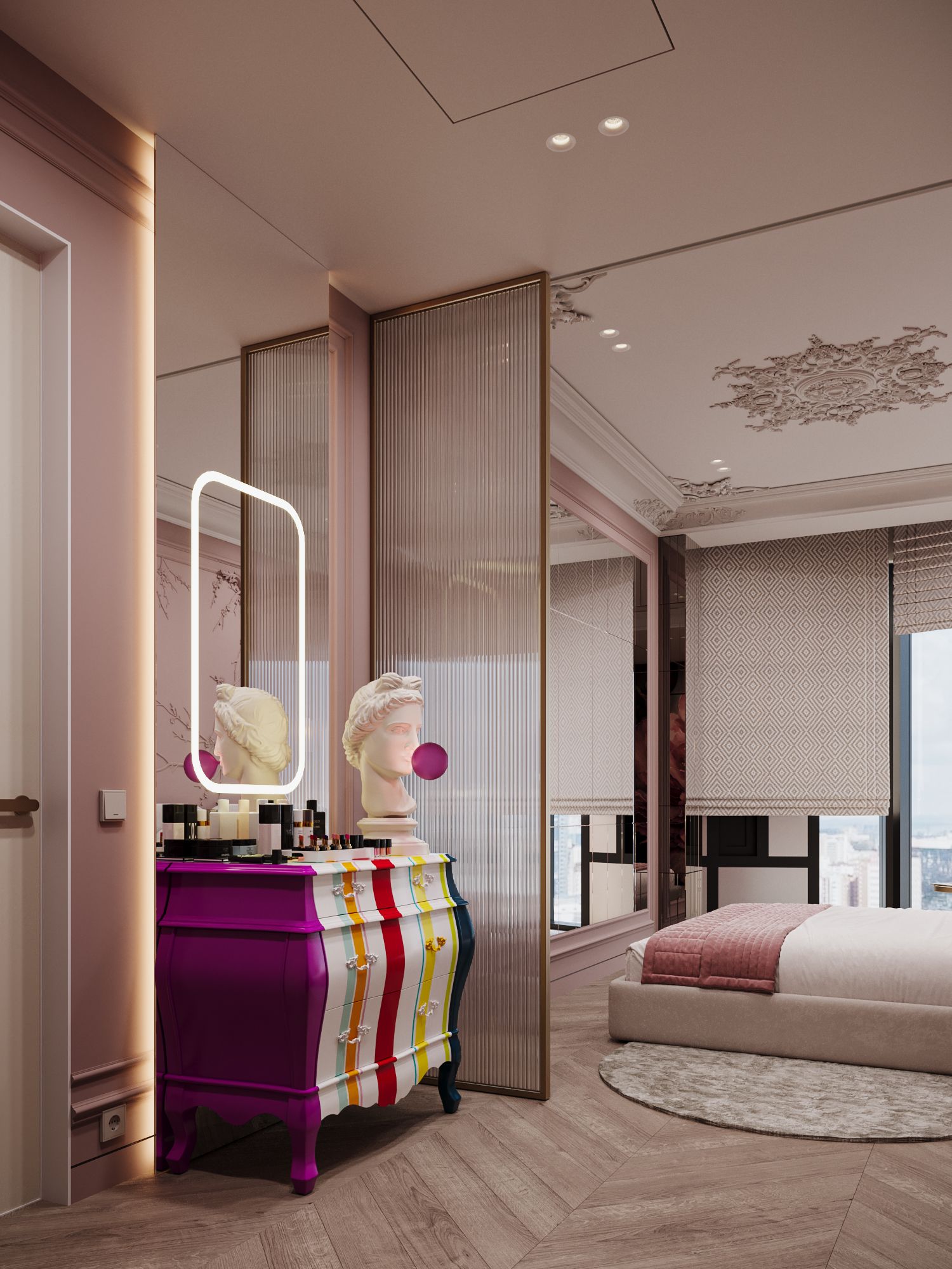
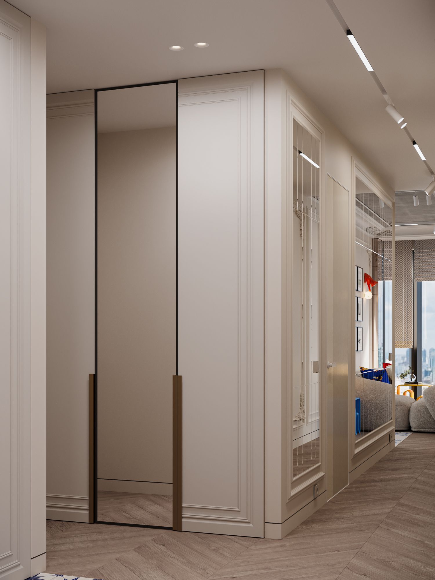
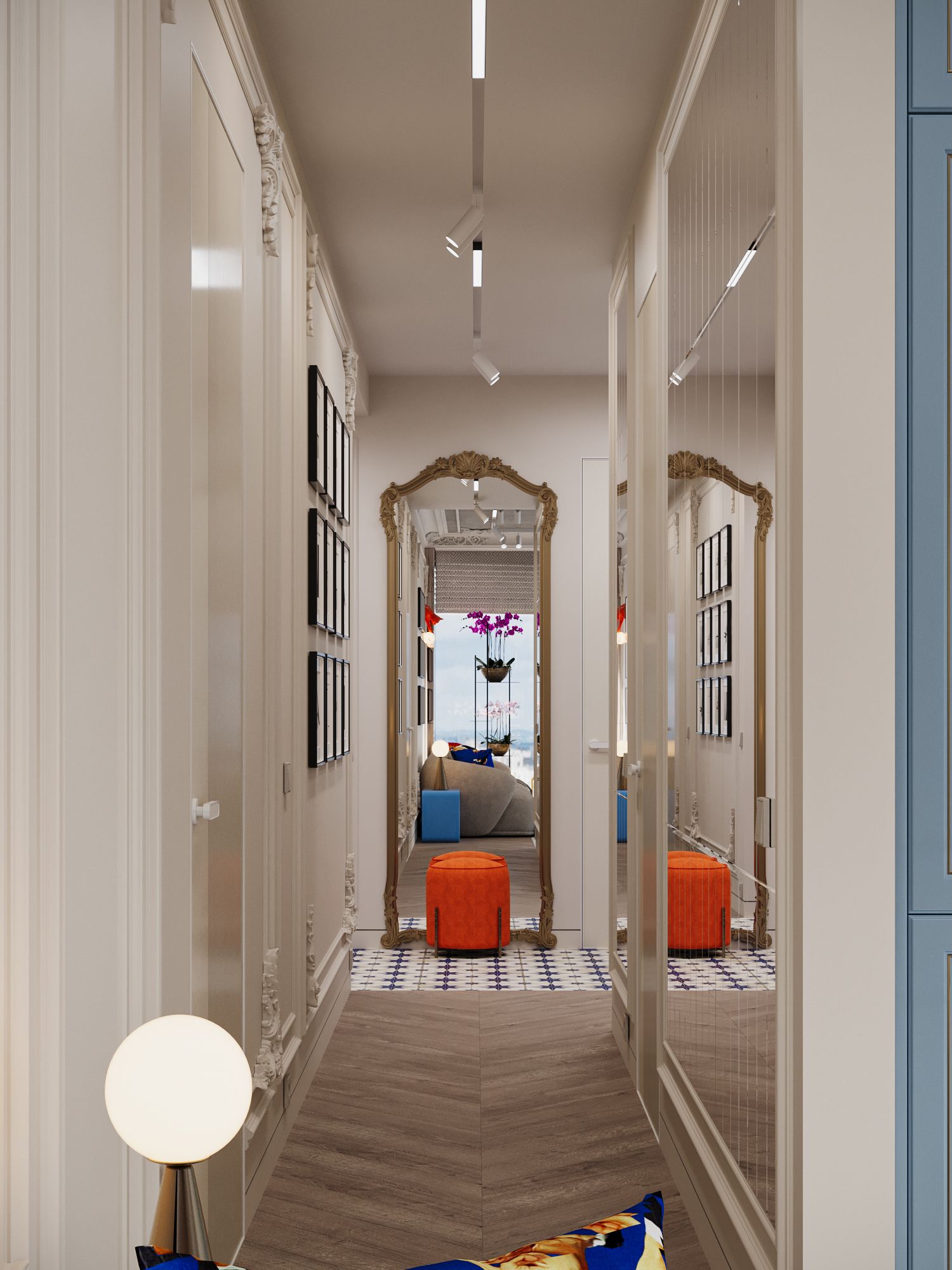
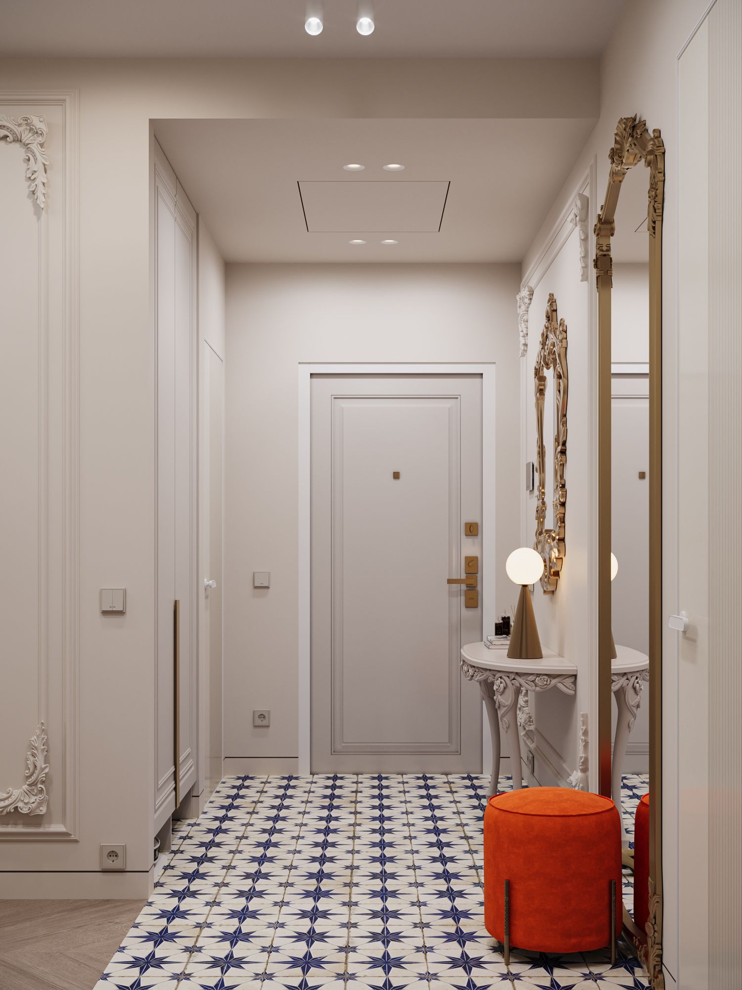
Decorative mouldings, cornices, ceiling roses and plaster details appear throughout the apartment. However, they are not used to create a literal period interior. Instead, they are combined with track lighting, streamlined built-in cabinetry, contemporary furniture and bold areas of colour.
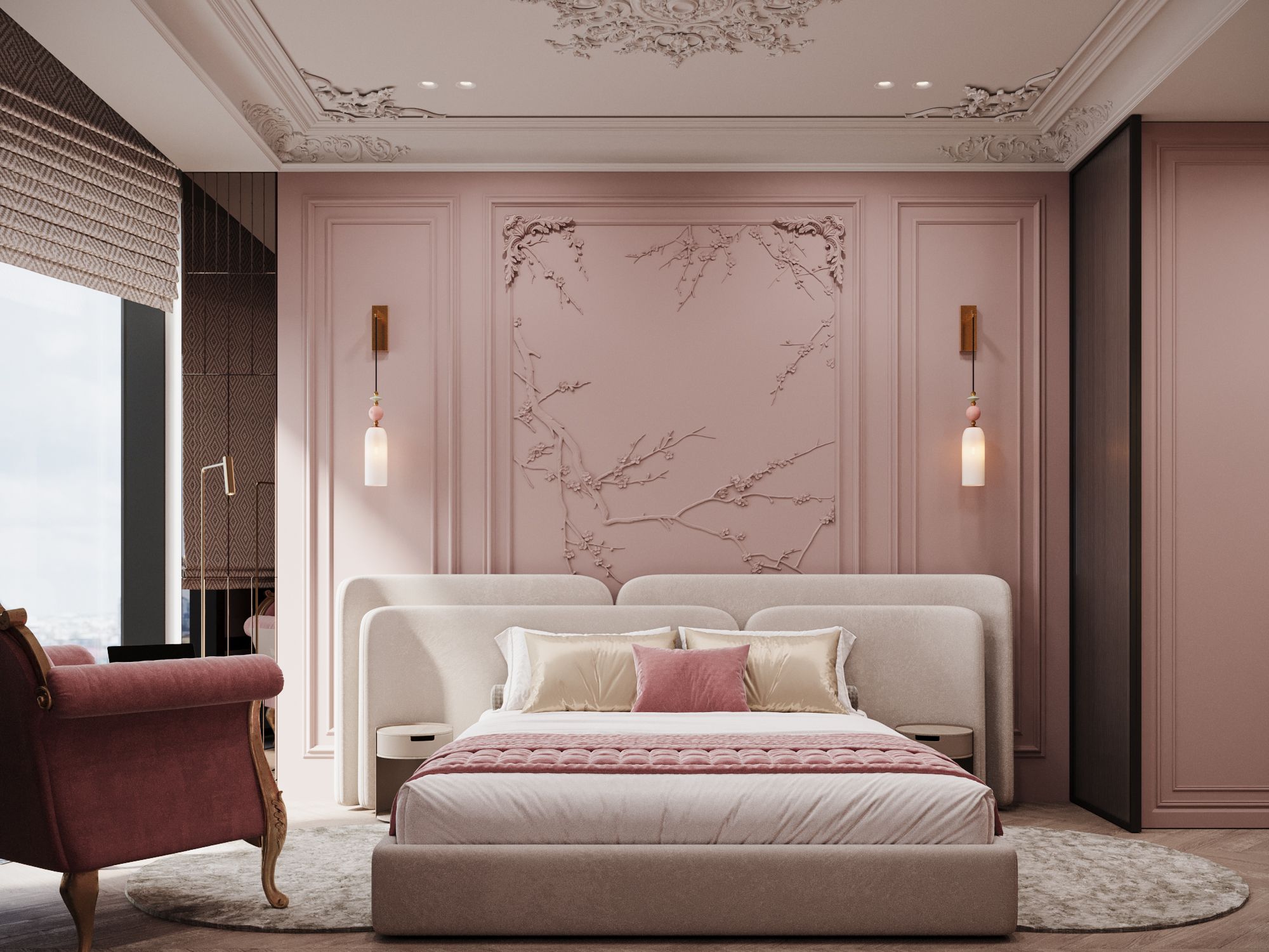
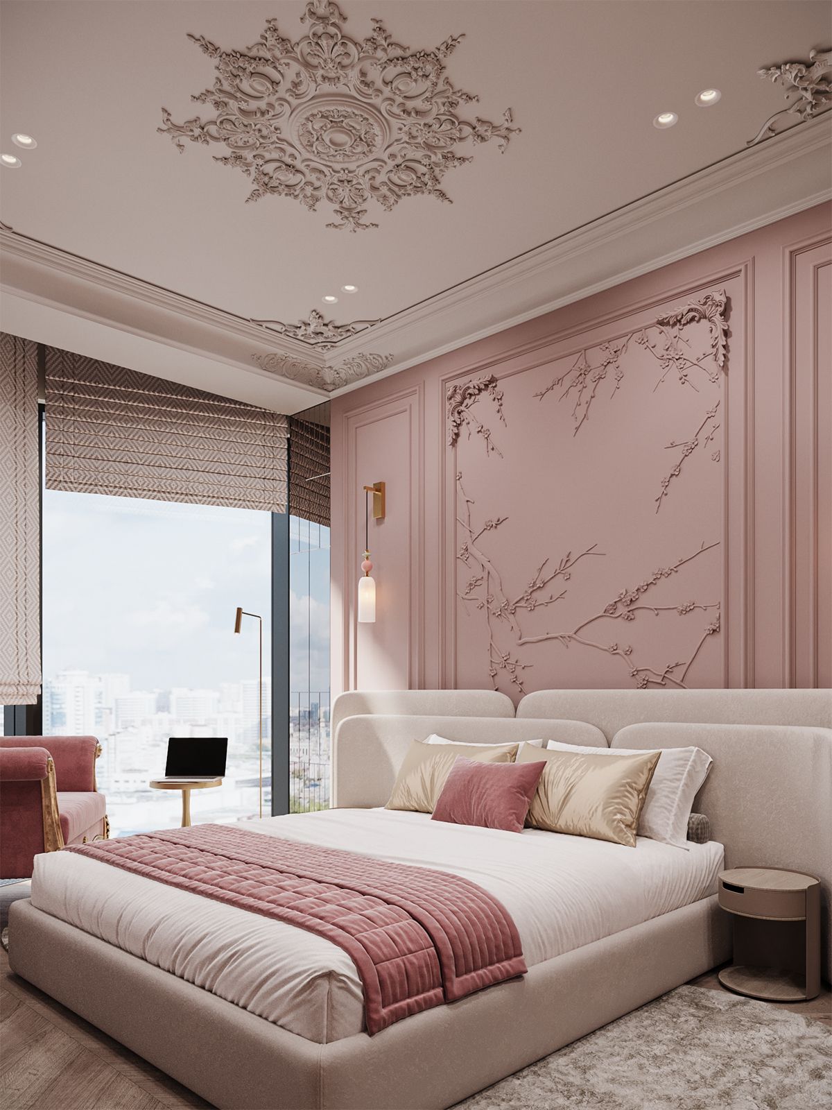
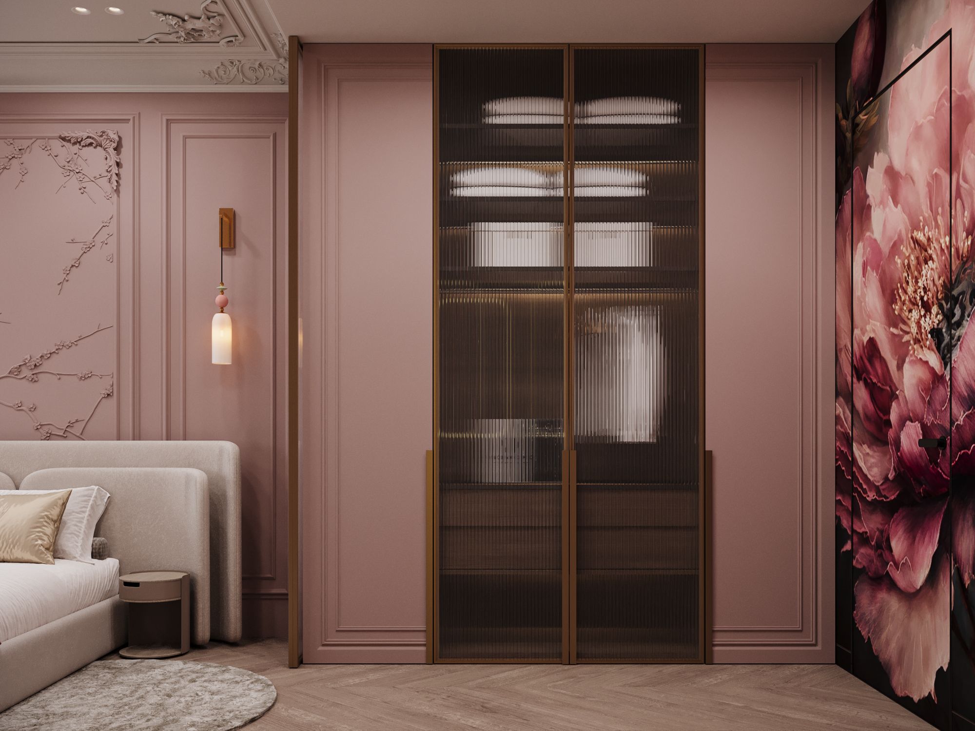
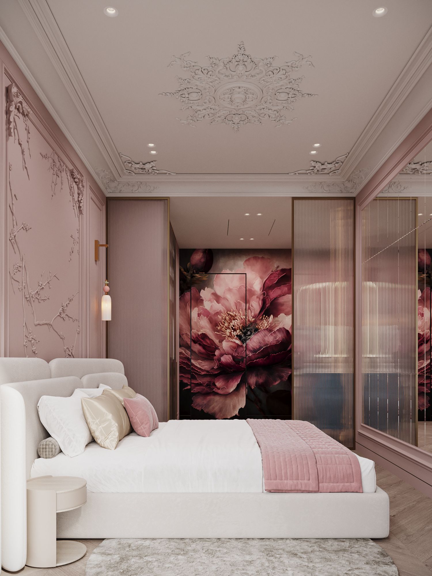
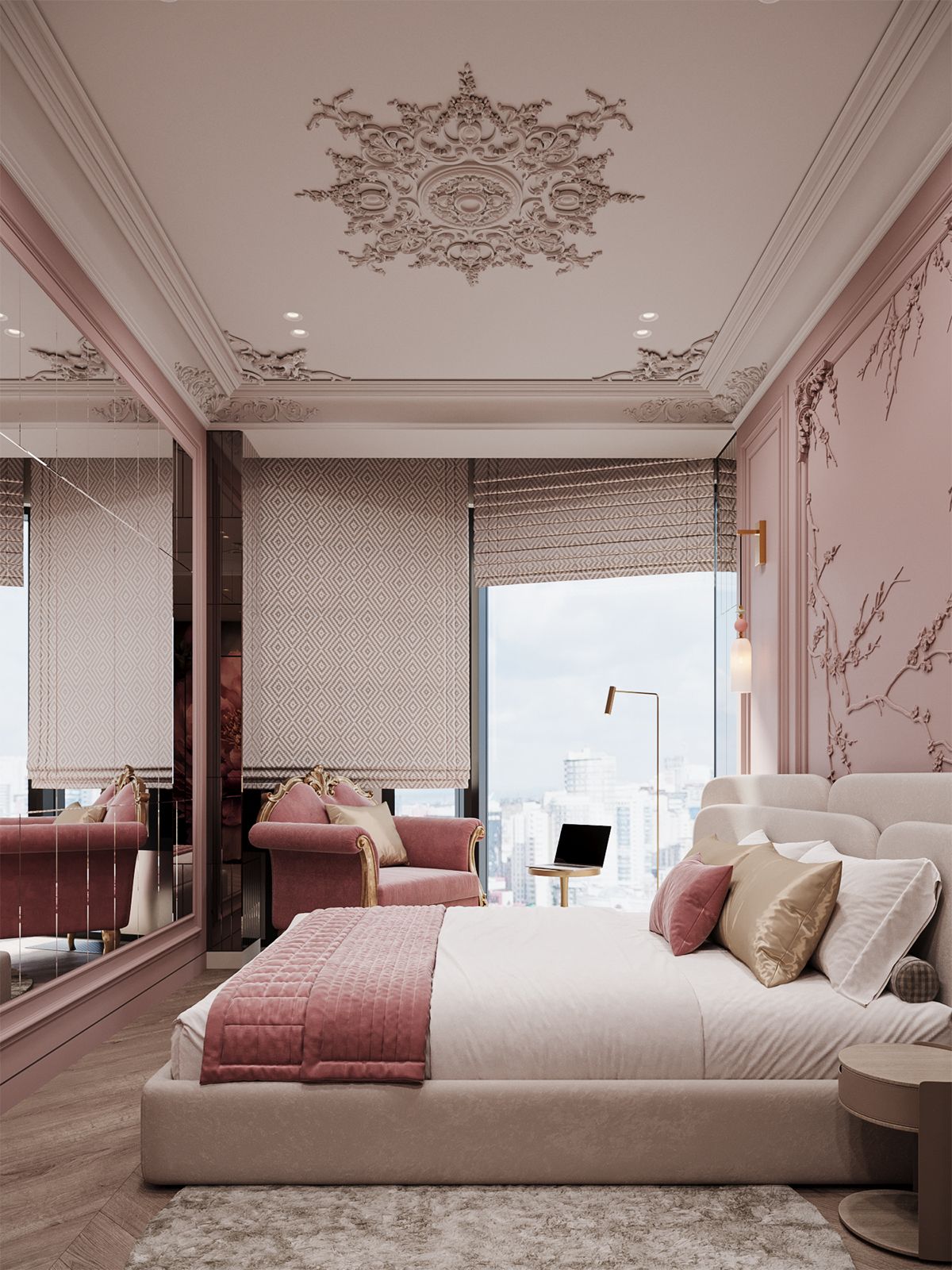
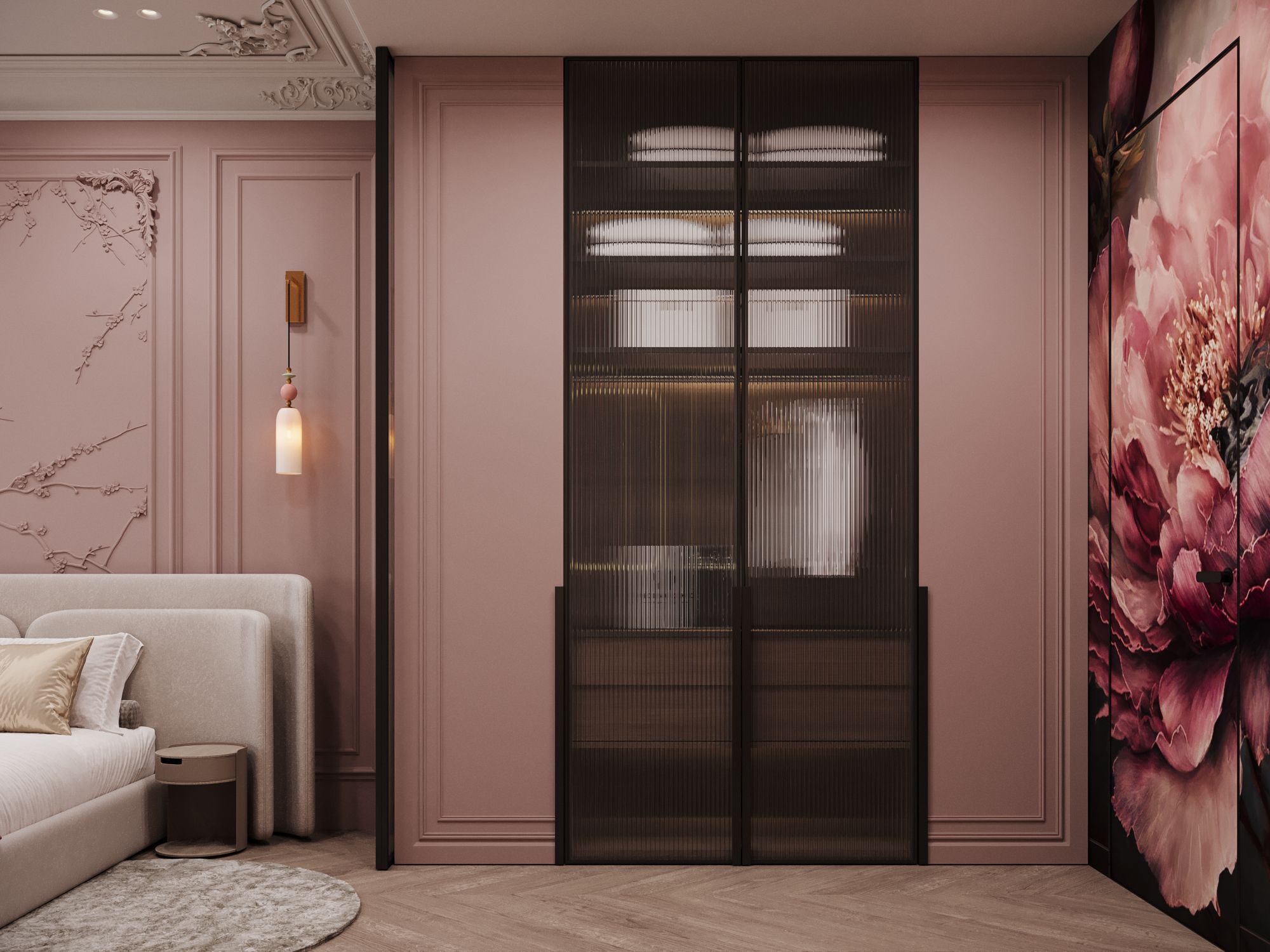
In her bedroom, the walls are finished with panels painted in a muted dusty pink, together with a sculptural botanical relief. Soft textiles, a generous rug and a tall upholstered headboard create a private, enveloping atmosphere.
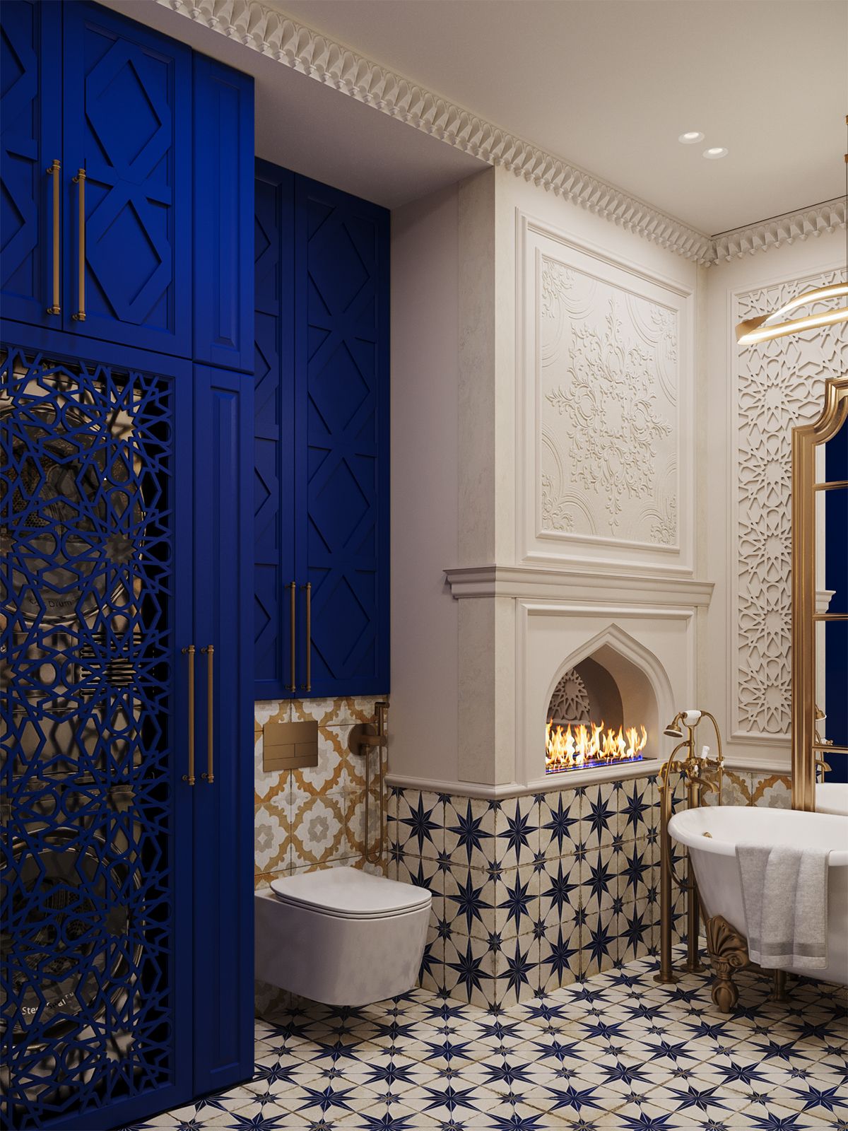
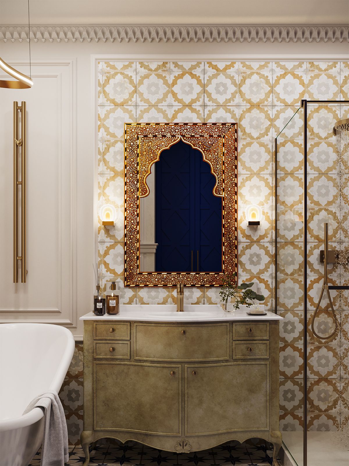
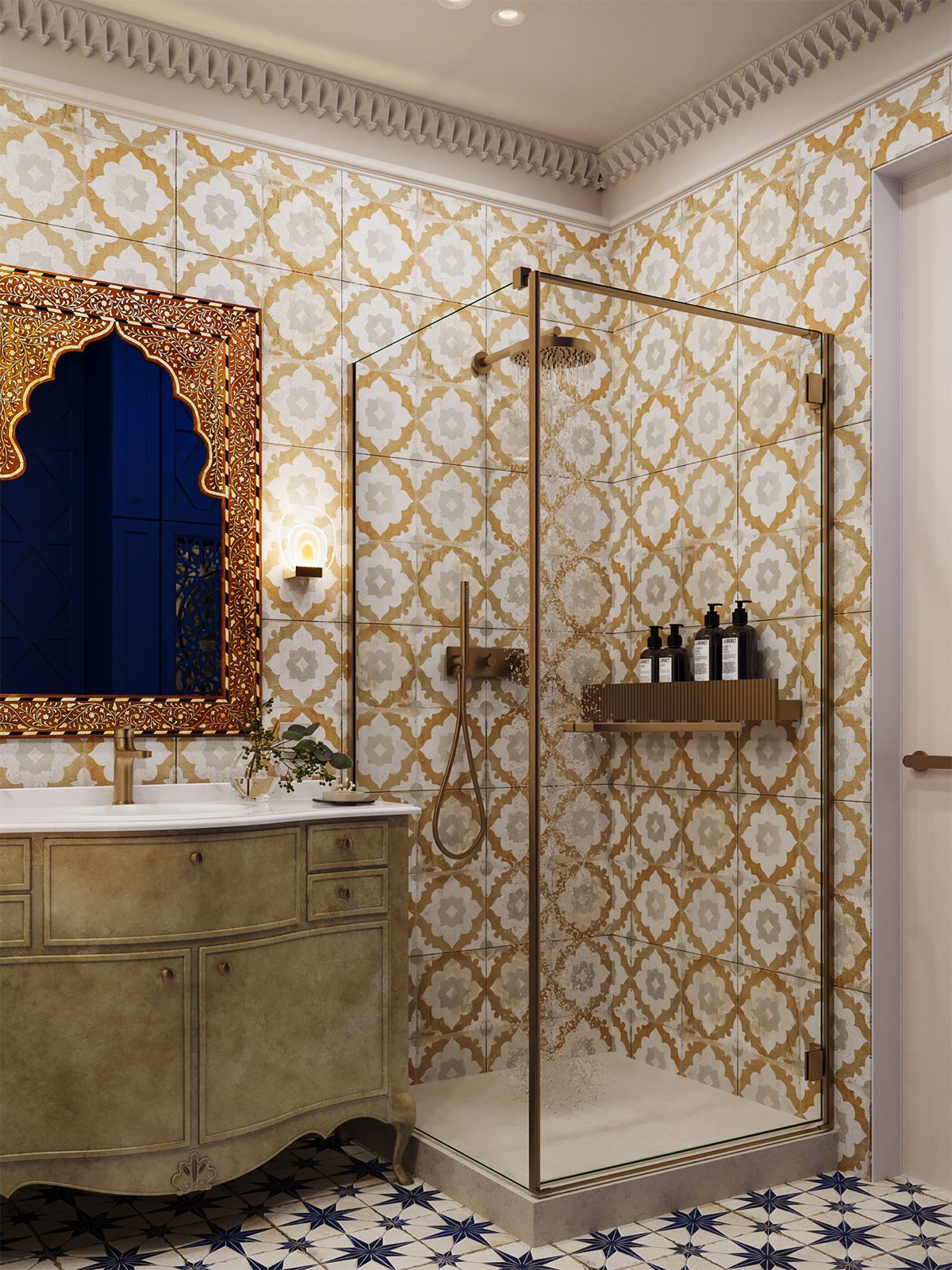
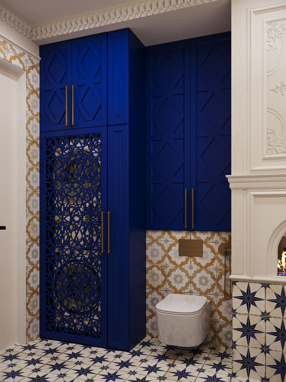
Her bathroom is deliberately more decorative. Patterned porcelain tile, pierced panels, sculptural mirrors, brass details and layered ornamentation create an almost jewel-box effect.
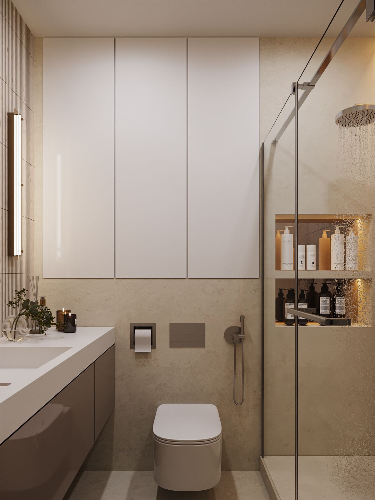
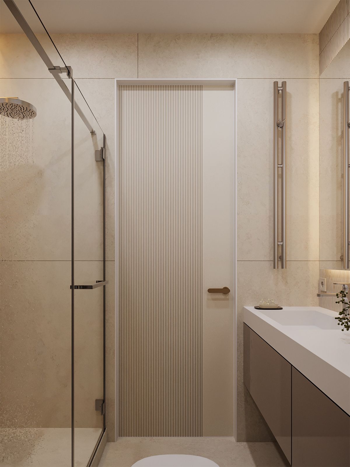
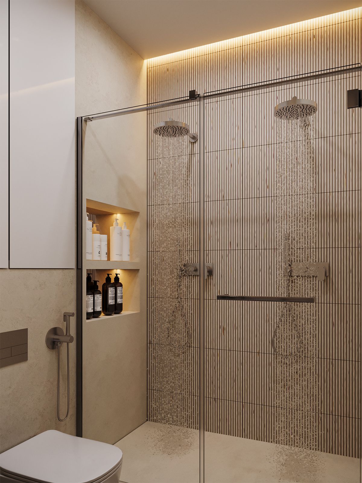
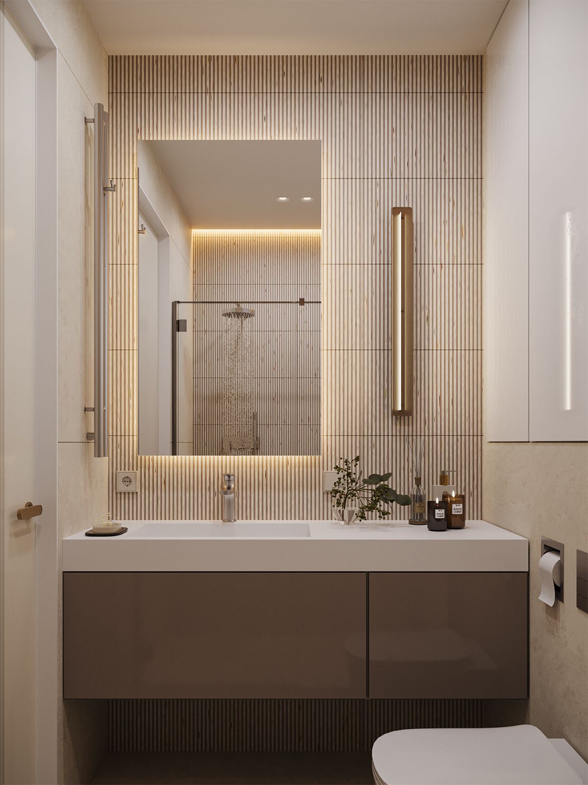
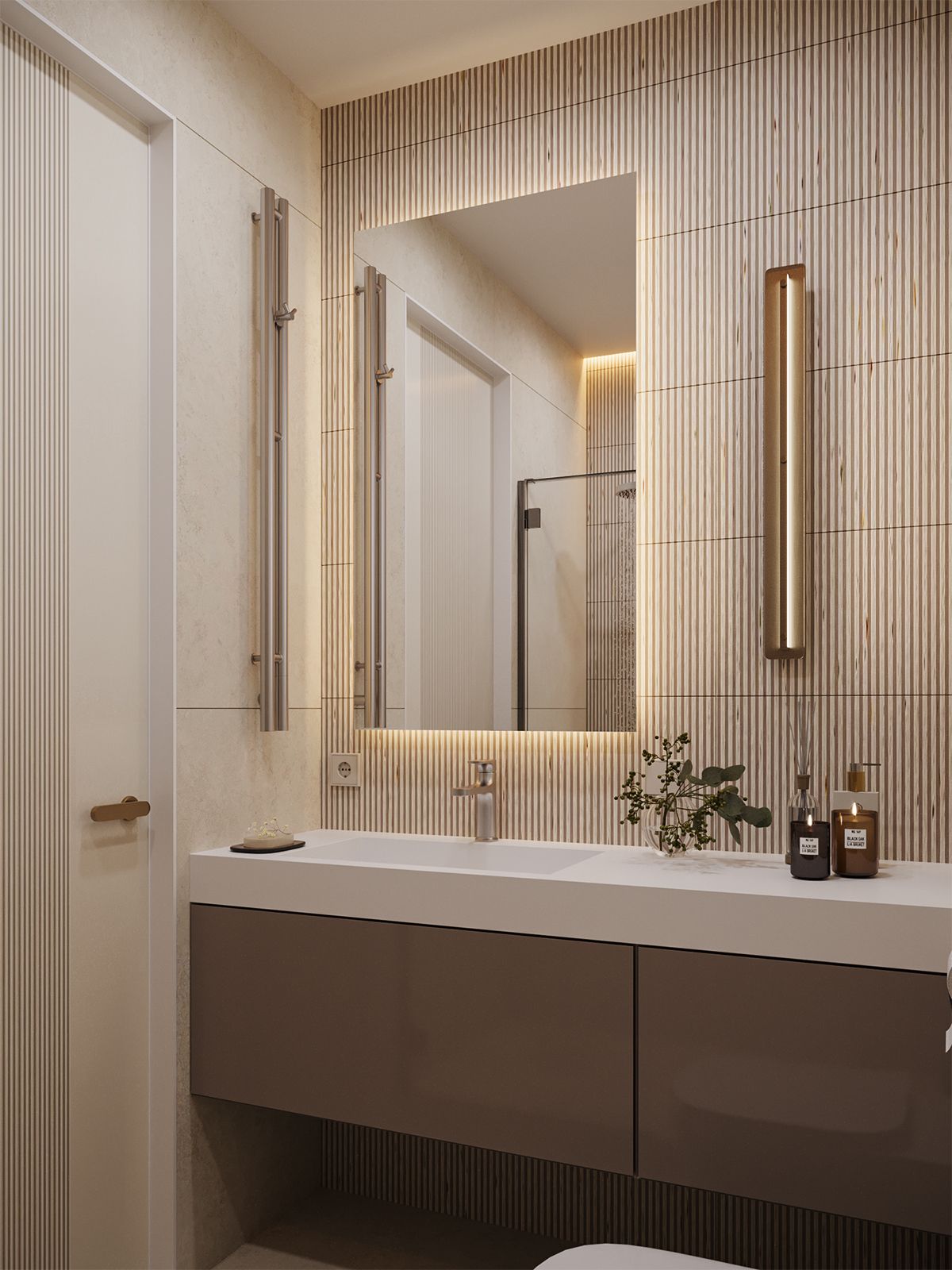
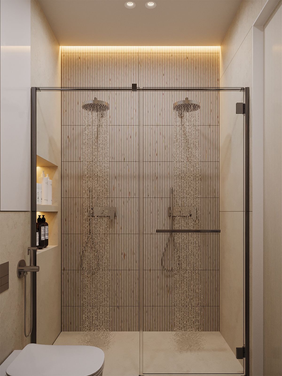
His shower room takes the opposite approach. Large-format stone-effect surfaces, frameless glass, integrated niches and smooth cabinet fronts make the compact room feel clean, calm and spacious. The reduced number of joints also makes the surfaces easier to maintain.
Design and style
The project is rooted in contemporary eclecticism, with references to neoclassicism, Art Deco and postmodern design.
Its neoclassical language is expressed through symmetry, wall mouldings, cornices, ceiling roses, panelled cabinetry and traditional proportions. Art Deco influences appear in the use of brass, mirrors, saturated colour and furniture with distinctive silhouettes.
The postmodern element lies in the freedom—and slight irony—with which these ingredients are combined. Traditional plasterwork sits alongside technical track lighting. A pale blue kitchen is paired with cobalt-blue and red chairs, while a quiet white sofa is surrounded by graphic prints, sculptural furniture and unexpected decorative objects.
Her side of the apartment is more emotional, ornamental and theatrical. His spaces are based on clear geometry, calm materials and a subdued natural palette. The kitchen and living room become the point at which these two worlds meet: a classically detailed architectural shell is filled with contemporary furniture and almost gallery-like splashes of colour.
This is why the phrase “Bipolar Chic” feels so apt. The interior genuinely has two poles, yet rather than competing with one another, they create tension, energy and a strong sense of identity.
Colour palette
Each room has its own palette, while white and milky surfaces, brass details and recurring shades of blue connect the apartment as a whole.
In the kitchen and living area, a neutral background is animated by pale blue cabinetry, cobalt, red, yellow and touches of purple. The strongest colours are concentrated in individual pieces of furniture and decoration, allowing the room to remain light and cohesive rather than becoming visually chaotic.
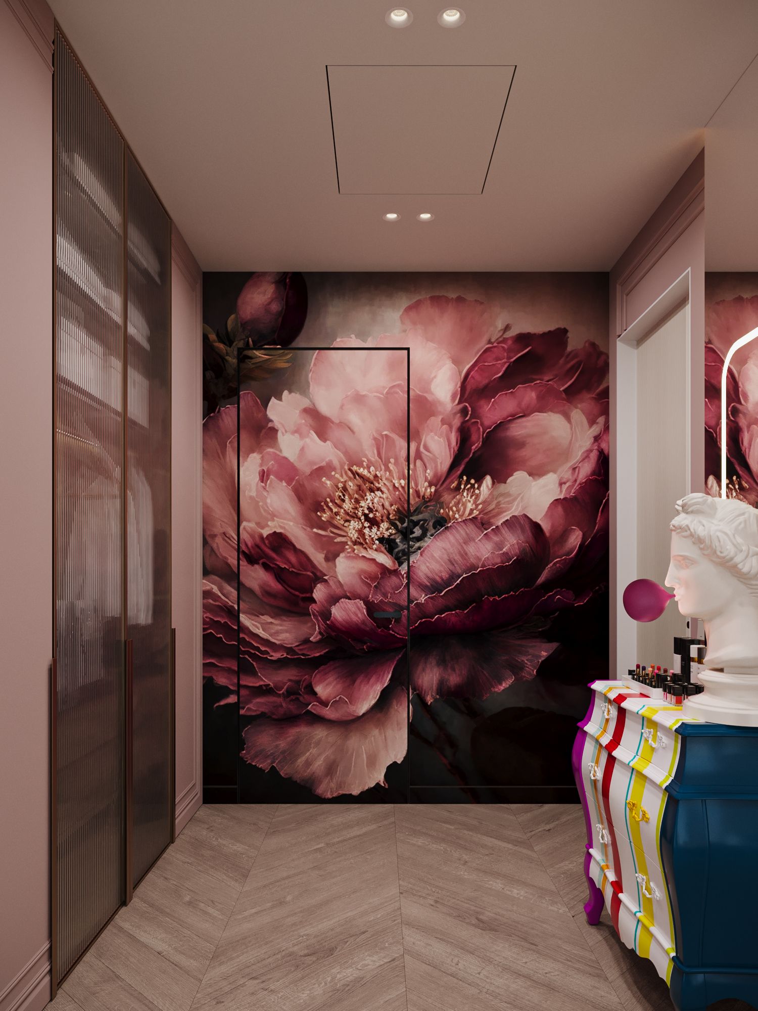
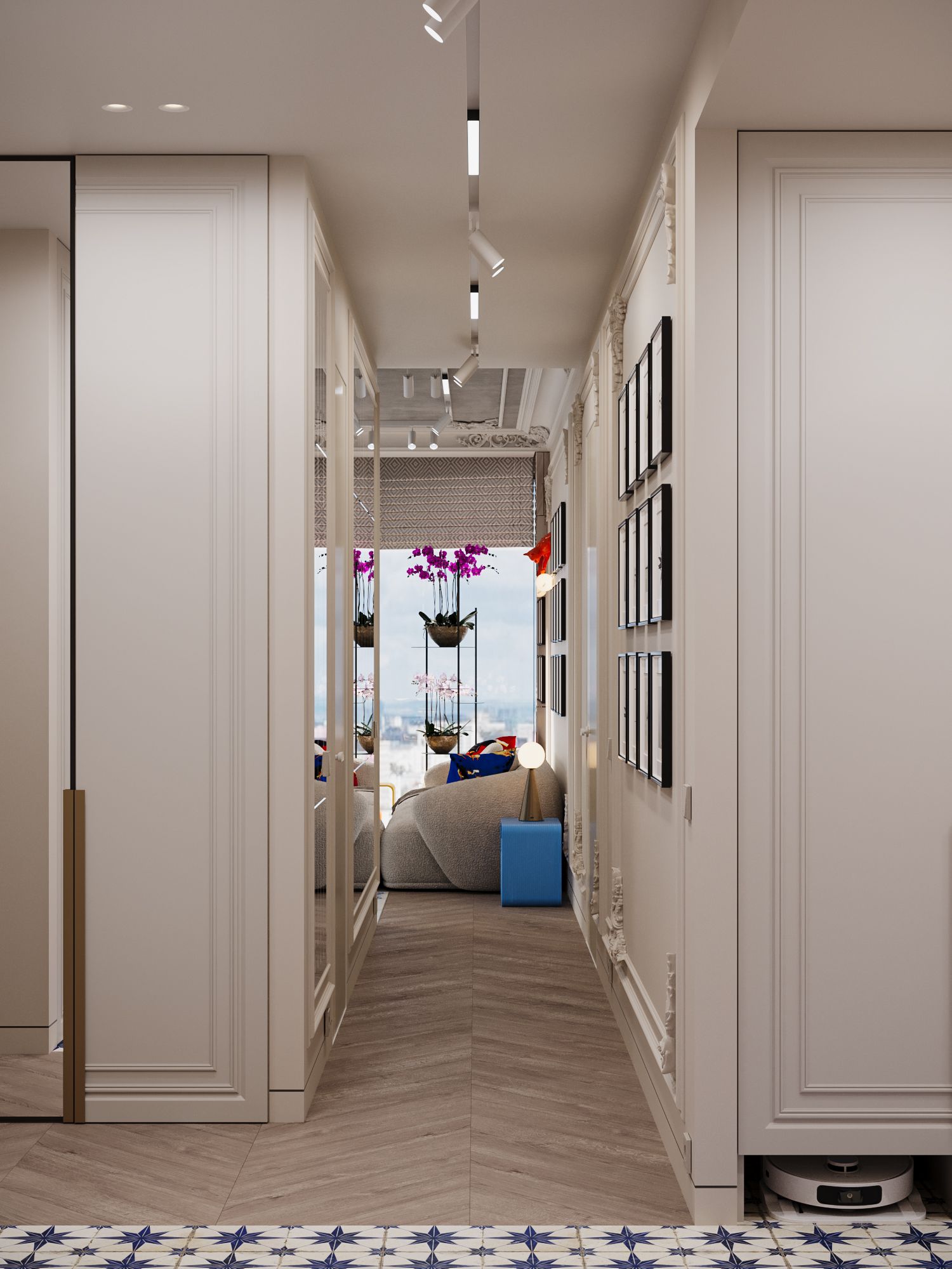
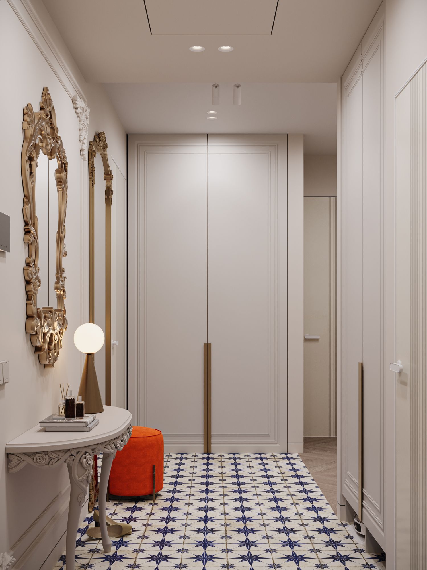
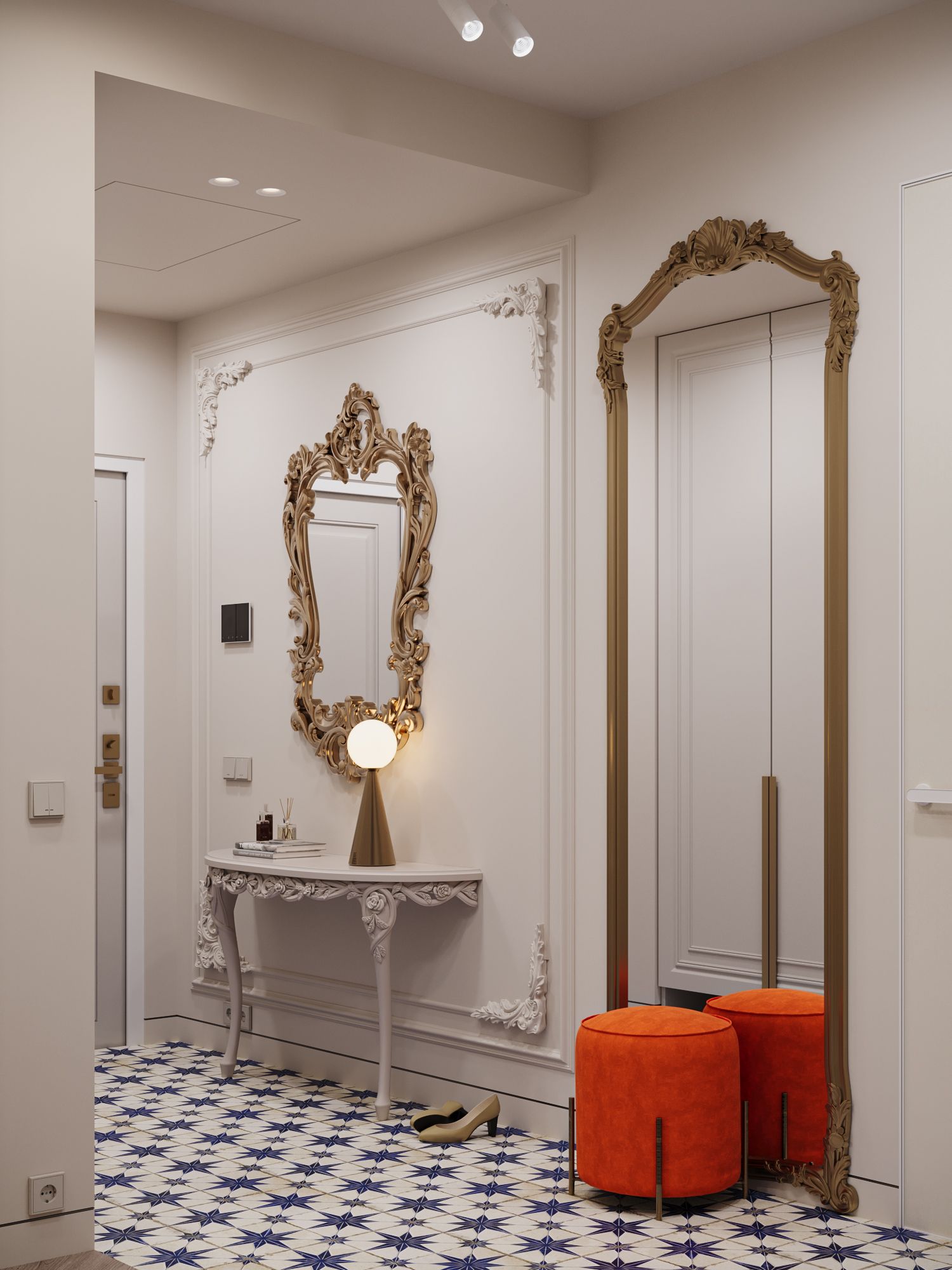
The entrance hall is predominantly white, with warm metallic details and a contrasting terracotta ottoman. Blue-and-white floor tiles connect the entrance with the kitchen and her bathroom.
Her bedroom is based on dusty pink, ivory and deep wine tones. The palette feels soft but not overly sweet: dark timber, brass and complex muted shades give the room depth and maturity.
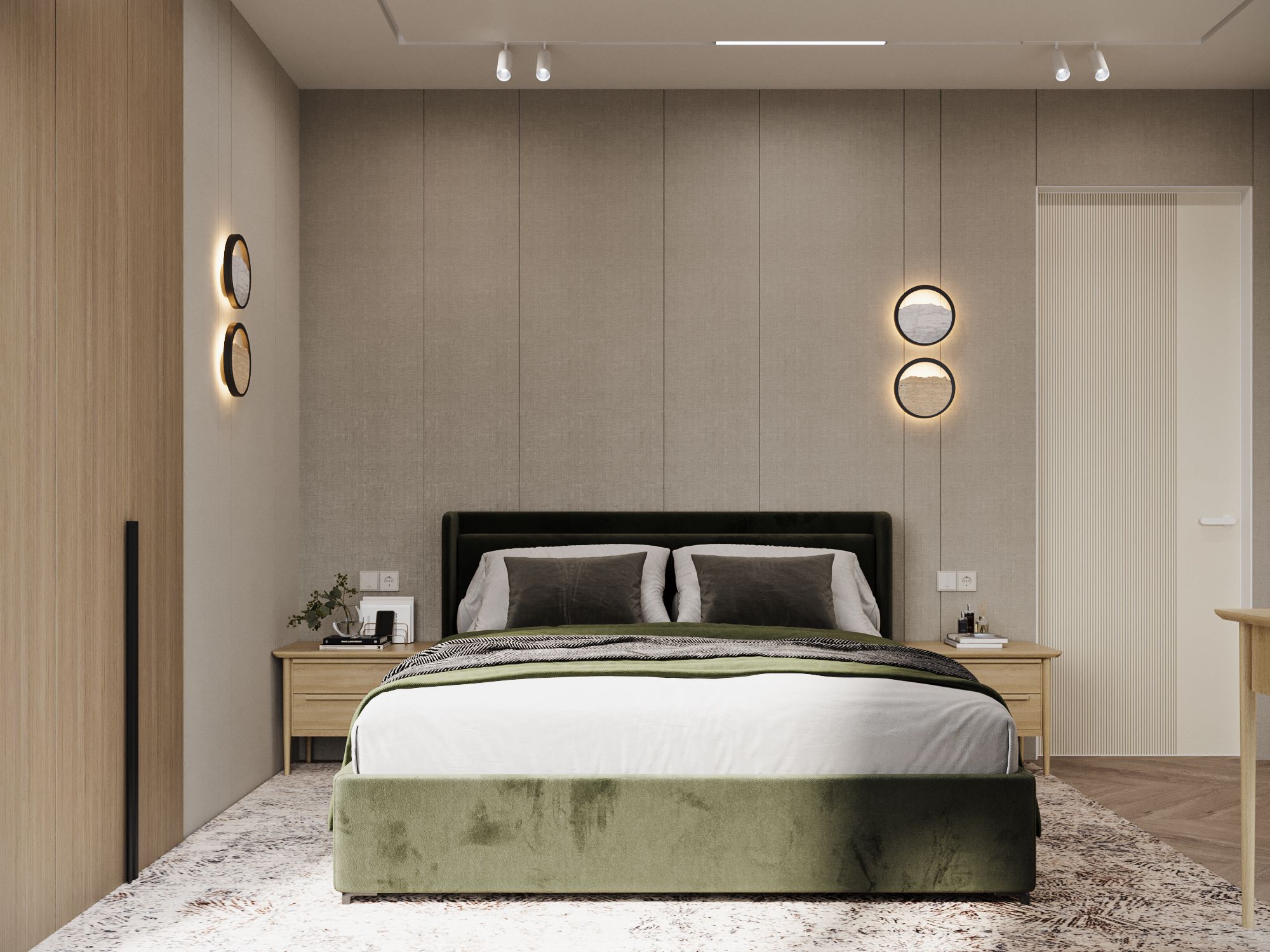
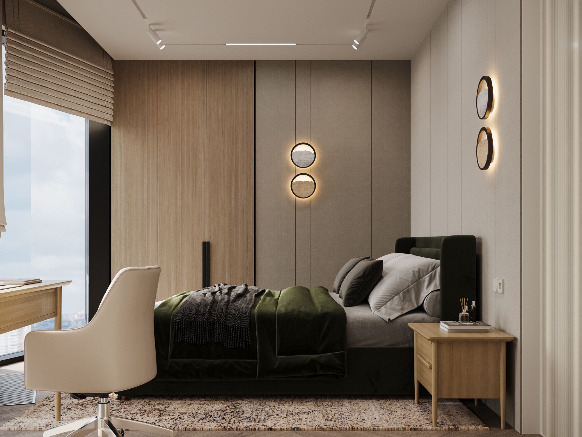
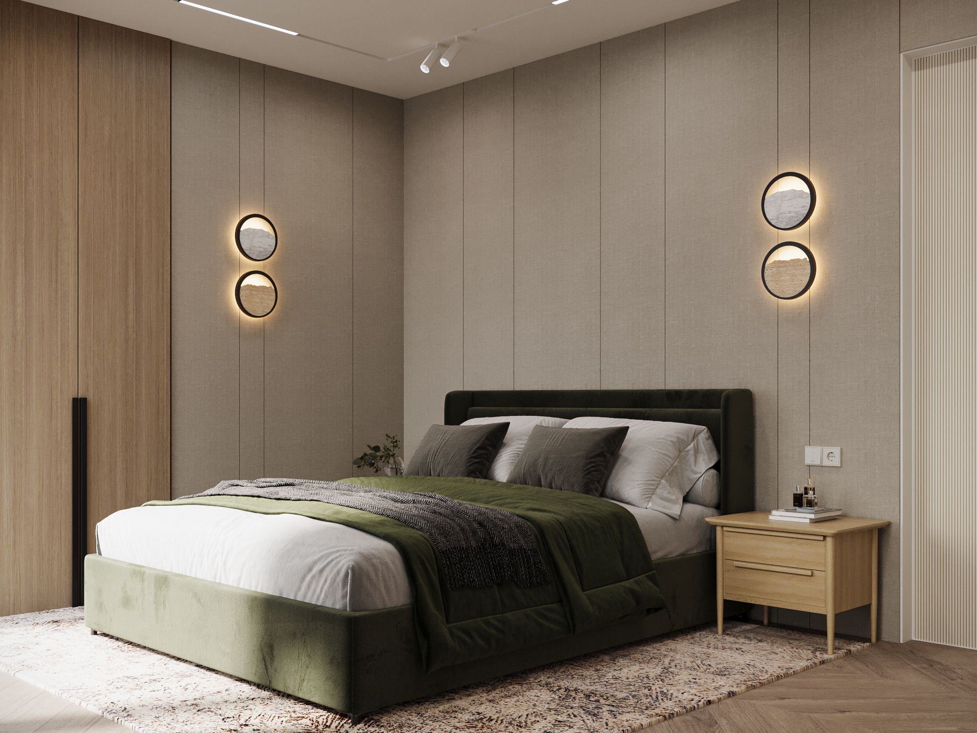
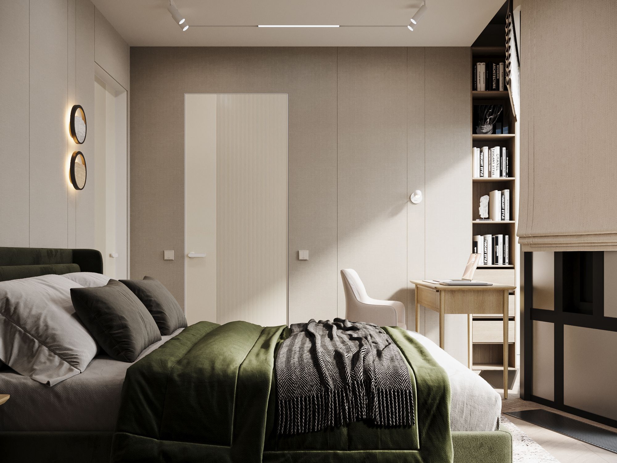
His bedroom combines taupe, natural timber, graphite and muted olive. Here, colour is not treated as an independent decorative gesture, but as a way to reinforce calm, order and visual quiet.
Her bathroom is the most elaborate room in the apartment, bringing together white, blue, warm beige and brass. His shower room, by contrast, is finished in a neutral stone palette.
Lighting scenarios
The lighting scheme is divided into four layers: general, functional, accent and decorative.
In the kitchen and living area, track lighting provides flexible general illumination. Adjustable spotlights can be directed towards the kitchen cabinets, work surfaces, dining table, artwork and individual design pieces. The panoramic windows bring in abundant natural light during the day, while in the evening the atmosphere is shaped by local and decorative lighting.
In the bedrooms, soft bedside lighting can be used independently from the main ceiling lights. In her bedroom, pendant lights reinforce the symmetry of the composition while keeping the bedside tables clear. In his room, wall lights create a more restrained graphic rhythm, while a table lamp provides a softer evening setting.
Her bathroom combines general lighting with mirror illumination and a decorative pendant. In his shower room, vertical lights around the mirror and integrated lighting inside the niches accentuate the stone texture and allow the room to be used without switching on bright overhead lighting.
In the entrance hall, technical spotlights provide even illumination, while the table lamp creates a warmer and more welcoming mood.
Furniture
The furniture follows the same principle of two contrasting poles.
In the shared living area, large, calm pieces—the white sofa, dining table and built-in kitchen—form a neutral foundation for more expressive accents. Red and blue chairs, printed upholstery, bright occasional tables and sculptural lighting are treated almost like pieces in a contemporary art collection.
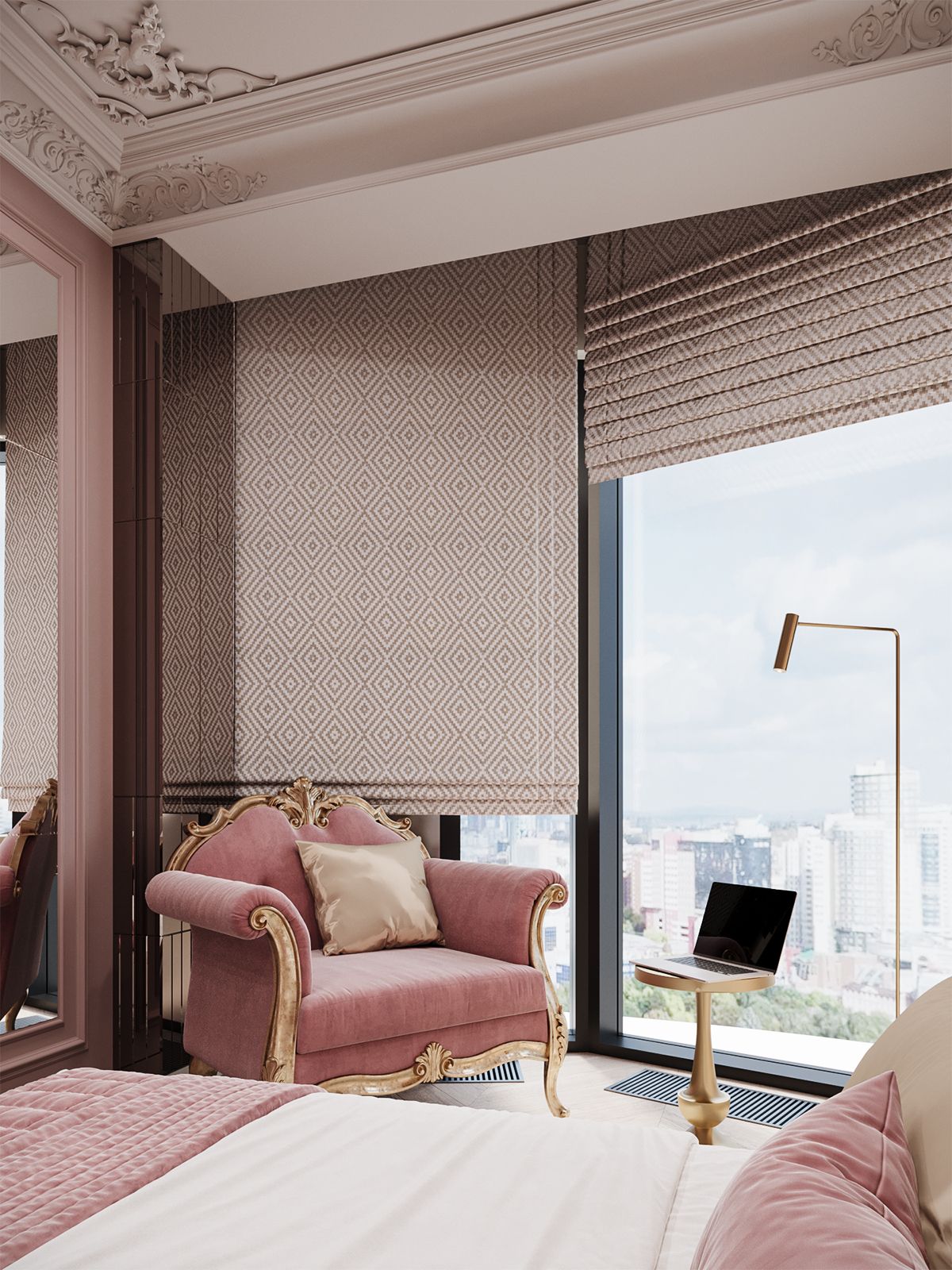
Her bedroom is shaped by soft, rounded forms. The tall upholstered headboard, classically inspired armchair and compact bedside tables create a sense of comfort and enclosure.
His bedroom is defined by cleaner rectangular volumes, natural timber, textile wall panels and a streamlined upholstered bed.
The principal storage systems and kitchen furniture were designed to fit the architecture of the apartment. Bespoke cabinetry allowed us to use the full height of the rooms, integrate storage and maintain a sense of visual order.
Tactile upholstery—bouclé, velvet and densely woven textiles—softens the interior, while timber, glass and metal introduce structure and contrast.
The result
This project does not attempt to reduce different tastes to a common denominator. Its purpose is to give every family member a space of their own while preserving the apartment’s overall coherence.
Here, “Bipolar Chic” does not mean a chaotic mixture of styles. It describes a deliberate dialogue between masculine and feminine, classic and contemporary, calm and expressive, neutral and saturated.
It is precisely this interaction between opposites that gives the apartment its distinctive and memorable character.